# Introduction

Twinr is a **no-code** mobile app builder that lets you convert your website into fully functional iOS and Android apps in just a few clicks.

With [Twinr](https://twinr.dev/), you don’t need to hire developers or spend months building apps. It’s designed for business owners, e-commerce stores, and SaaS companies who want to launch and grow their apps quickly and cost-effectively.

**Key benefits of using Twinr:**

* Build mobile apps without coding
* Launch on iOS & Android within 2–3 weeks
* Engage customers with push notifications
* Track performance with built-in analytics
* Save time and reduce ongoing maintenance costs

#### FAQs

<details>

<summary>Do I need coding skills to use Twinr?</summary>

No. Twinr is completely no-code. Everything is visual and easy to set up.

</details>

<details>

<summary>How long does it take to build an app?</summary>

Most apps are ready within 2–3 weeks, depending on customization and store approvals.

</details>

<details>

<summary>Can I update my app after publishing?</summary>

Yes. Any changes you make in Twinr are reflected in your app without re-submitting to the stores (except for major updates).

</details>

<details>

<summary>What platforms does Twinr support?</summary>

Twinr builds apps for iOS and Android.

</details>

<details>

<summary>Is Twinr suitable for my Shopify/WooCommerce store?</summary>

Absolutely. Twinr is designed for e-commerce businesses and integrates seamlessly with Shopify, WooCommerce, and other platforms.

</details>


# Fun Fact

Our logo isn’t just a design – it carries the meaning and vision behind Twinr. Here’s the story:

### What does "<mark style="color:green;">Twinr</mark>" mean?

“Twinr” stands for Twin of your website.

We help you transform your website into mobile apps that look and feel the same. This ensures your customers get a seamless experience whether they’re browsing on web, iOS, or Android.

### The Secret of "." in Logo

<div align="left"><img src="/files/UBrJxsMGjBFWGS3sGa5i" alt="" width="128"></div>

Have you noticed the dot (.) after “t” in our logo? It’s not just decoration – it represents completion.

At Twinr, we complete your development needs by giving you fully functional, beautiful mobile apps for both Android & iOS.


# Create App from Template

{% embed url="<https://youtu.be/gPfH_VhXVLk>" %}

​<img src="https://files.gitbook.com/v0/b/gitbook-x-prod.appspot.com/o/spaces%2F-MlBy5z08zL1UoCwNqmg%2Fuploads%2FWiH0f7FRvMSqgqKHif1N%2Fcreate_new_app_step-1.0.png?alt=media&#x26;token=61c5d5e1-7e89-41b5-bd04-d68cfd200801" alt="" data-size="original"> <img src="https://files.gitbook.com/v0/b/gitbook-x-prod.appspot.com/o/spaces%2F-MlBy5z08zL1UoCwNqmg%2Fuploads%2FznjuUWHogf4kx4oCcEX6%2Fcreate_new_app_step-1.1.png?alt=media&#x26;token=2fadf0a4-cfa8-4b7d-8e30-b51de540110f" alt="" data-size="original">

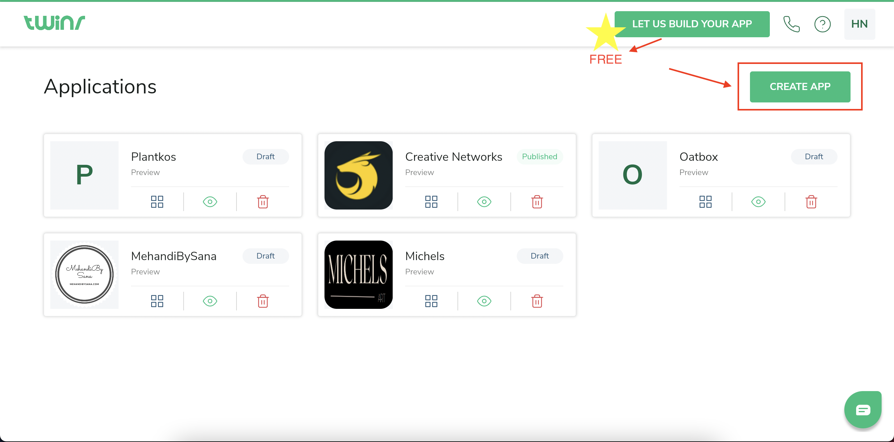
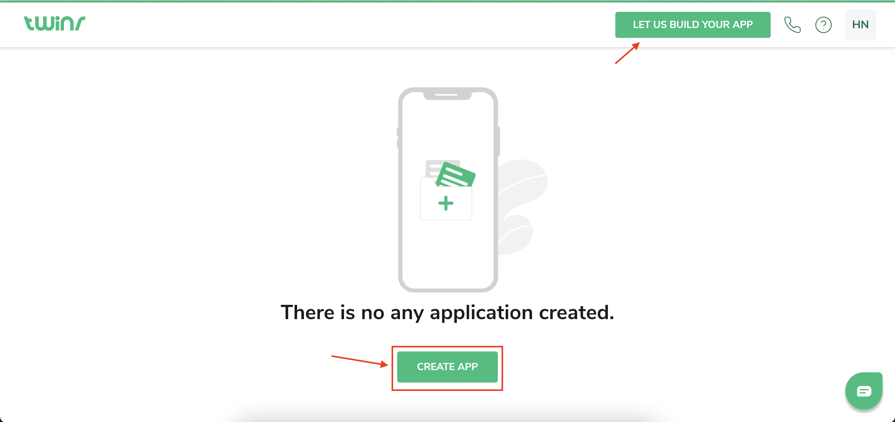
* Click on " Create new App " button.
  * If you don't have any apps created, you will see blank screen as shown in image 1.
  * If you already have some apps created and want to create another one, you will see the Dashboard screen as shown in image 2.
* Fill the form and create blank app as shown in [this](https://help.twinr.dev/create-app/pages/MQNue9OSHxgKGdoaFjjp#1.-blank) step.

![Select App Template](/files/lKmuZUM1M4tSXdVW2NPm)

* Choose the App template from below existing choices.
  * **Blank** : It will create a blank app with just one tab bar.
  * **E-Commerce** : If you have a E-Commerce app, we recommend to go with this option.
  * **News** : If you have a Blogging, News, Information app, we recommend to go with this option.
  * **Restaurant** : If you run a Restaurant, Grocery Store, we recommend to go with this option.


# Blank

​![](https://files.gitbook.com/v0/b/gitbook-x-prod.appspot.com/o/spaces%2F-MlBy5z08zL1UoCwNqmg%2Fuploads%2FHhdsbA1iPEKZko28d0tX%2F4.0%20Blank%20App%20Form.png?alt=media\&token=a1762807-1c8b-4928-9590-70b4a1fdc60f)​

* **App name:** You can name your application here. You can change it later in My Account section. Ex. "My E-commerce App"
* **Your website:** Enter the URL of the website you want to convert. This field is mandatory and needs to be in a proper format. ex. <https://ecommercely.twinr.site/>

<mark style="color:red;">\*All URL must be in format of <https://domain.ex>. You must fill all the information to enable the build app button.</mark>**​**

* **Industry:** This field is for the industry of your business. Ex. here we have taken "E-commerce". We have some options provided as shown in image below. If you don't find any option, please choose "other".

![](/files/HMCi5NaNQjtyO1B2fk9u)

* **Website Platform:** Here, choose a technology on which your existing website is built. We have some options provided as shown in image below. If you don't find any option, please choose "other".

![](/files/9KJKHfRXIwVYszX7oUvL)

* **Remove Header, Remove Footer:** Twinr Automation Engine will detect unwanted elements like your website header, footer and remove from your app. We recommend to use it, because these elements from website is not useful to show in mobile apps.

![](/files/uljryxvSHCu7Z9onqECf)

* Click on " **Build app** "


# E-Commerce App

​![](https://files.gitbook.com/v0/b/gitbook-x-prod.appspot.com/o/spaces%2F-MlBy5z08zL1UoCwNqmg%2Fuploads%2FaLPgrf7Cv7PRDFIqkAmf%2FScreen%20Shot%202022-06-24%20at%201.00.23%20PM.png?alt=media\&token=7b8b8c6d-5628-45af-8fae-deadae043d91)​![](https://files.gitbook.com/v0/b/gitbook-x-prod.appspot.com/o/spaces%2F-MlBy5z08zL1UoCwNqmg%2Fuploads%2FJyMlvZoZ4UQqgoUWPCKg%2FScreen%20Shot%202022-06-24%20at%201.16.25%20PM.png?alt=media\&token=c14e1362-3696-4ddd-81ac-08404d939c9f)​

* **App name:** You can name your application here. You can change it later in My Account section. Ex. "My E-commerce App"
* **Industry:** This field is for the industry of your business. We have some options provided as shown in image below. If you don't find any option, please choose "other".

  ![](/files/HMCi5NaNQjtyO1B2fk9u)
* **Website Platform:** Here, choose a technology on which your existing website is built. If you don't find any option, please choose "other". We have some options provided as shown in image below. If you don't find any option, please choose "other".

  ![](/files/9KJKHfRXIwVYszX7oUvL)
* Click on " **Next** "
* **Home Screen:** Enter the URL of the website you want to convert. This field is mandatory and needs to be in a proper format. ex. <https://ecommercely.twinr.site/>**​**
* **Shop Screen:** Enter the URL of your website's shop page. This field is mandatory and needs to be in a proper format. ex. <https://ecommercely.twinr.site/shop/>**​**
* **Cart Screen:** Enter the URL of your website's cart page. This field is mandatory and needs to be in a proper format. ex. <https://ecommercely.twinr.site/cart/>**​**
* **Account Screen:** Enter the URL of your website's account page. This field is mandatory and needs to be in a proper format. ex. <https://ecommercely.twinr.site/my-account/>

<mark style="color:red;">\*All URL must be in format of <https://domain.ex>. You must fill all the information to enable the build app button.</mark>

* **Remove Header, Remove Footer:** Twinr Automation Engine will detect unwanted elements like your website header, footer and remove from your app. We recommend to use it, because these elements from website is not useful to show in mobile apps.

![](/files/uljryxvSHCu7Z9onqECf)

* Click on " **Build app** "


# News App

​![](https://files.gitbook.com/v0/b/gitbook-x-prod.appspot.com/o/spaces%2F-MlBy5z08zL1UoCwNqmg%2Fuploads%2F11eZt3Fet3QMgXiQ3HQf%2FNews%20screen.png?alt=media\&token=a6d128a0-3683-4202-b459-4a9bc897fbdc)**​**

* As shown in image, it will ask you some information to fill. It is similar to [here](/create-app/create-app-from-template/e-commerce-app).

<mark style="color:red;">\*All URL must be in format of <https://domain.ex>. You must fill all the information to enable the build app button.</mark>


# Restaurant App

​![](https://files.gitbook.com/v0/b/gitbook-x-prod.appspot.com/o/spaces%2F-MlBy5z08zL1UoCwNqmg%2Fuploads%2Fqtt15zDEWBpAMAM3KCTD%2FRestaurant%20screen.png?alt=media\&token=0869fc54-5278-405e-993d-262320bba652)**​**

* As shown in image, it will ask you some information to fill. It is similar to [here](/create-app/create-app-from-template/e-commerce-app).

<mark style="color:red;">\*All URL must be in format of <https://domain.ex>. You must fill all the information to enable the build app button.</mark>


# Create Organization

### What is organization?

Organization is a group of team member who can work together for the applications created under that organization.

### How to create new organization?

As an example, If you have multiple businesses for which you have created applications, you can manage it in different organizations. Also, you can have different team members in all your organizations! Cool, right? Let's see how you can create new organization.

### Step: 1 Click on organization and click on "+ Create Organization"

<figure><img src="/files/POfFw7AubUC7Uz6aROac" alt=""><figcaption></figcaption></figure>

<figure><img src="/files/ezY92oxIgK5Rfu68N7kv" alt=""><figcaption></figcaption></figure>

### Step: 2 Give organization name and click on "Add"

<figure><img src="/files/Jm1Btwk3xa2KA5XdNpnO" alt=""><figcaption></figcaption></figure>

### Step: 3 Create Apps in your organization and manage it.

<figure><img src="/files/SejgQdaV1jjmy587qhKM" alt=""><figcaption></figcaption></figure>


# Invite Members

You can add staff members, assign roles and let them manage your application.

You can also create multiple organizations under your account to better manage your applications.

| Role                           | Owner                                    | Admin                          | Developer |
| ------------------------------ | ---------------------------------------- | ------------------------------ | --------- |
| **Preview application**        | ✔️                                       | ✔️                             | ✔️        |
| **View/Edit application info** | ✔️                                       | ✔️                             | ✔️        |
| **Create application**         | ✔️                                       | ✔️                             |           |
| **Edit organization**          | ✔️                                       | ✔️                             |           |
| **Delete organization**        | ✔️                                       |                                |           |
| **Edit/Add/Delete members**    | ✔️                                       | ✔️                             |           |
| **Delete application**         | ✔️(regardless of an active subscription) | ✔️(if not active subscription) |           |
| **Purchase subscription**      | ✔️                                       |                                |           |

1. **Owner** : Owner is like a father of the organization. He has all the permissions.
2. **Admin** : Admin is like a product manager. He can manage everything except, delete organization and delete application if the subscription for that application is active.
3. **Developer** : Developer can edit and preview the application and all the information. But can not edit the organization and other members detail.

### How to Add new members?

### Step: 1 Click on "⚙️" button besides the organization name

<figure><img src="/files/x5XzCeP3ECnkOlK7udCi" alt=""><figcaption></figcaption></figure>

### Step: 2 Click on "Members" and "Invite Member"

<figure><img src="/files/oZ22yht6J5NE5nx46crl" alt=""><figcaption></figcaption></figure>

### Step: 3 Enter the email address of the member you want to invite and choose the role

<figure><img src="/files/VkXv2FH98BwhNvAazeEm" alt=""><figcaption></figcaption></figure>

### Step: 4 Choose the Applications you want to give permission to

<figure><img src="/files/Sv5QeecW2ZgzTWuDEQts" alt=""><figcaption></figcaption></figure>


# App Dashboard

![App Dashboard](/files/I9xUDcQfMErXhhDgLWGn)

Application Dashboard is the landing page of all the applications you have created.

You can go the App Home, Preview or delete app from here.

<img src="/files/XGTVK7SpuglSK1andKky" alt="" data-size="original"> --> When you click on this Home icon, it will redirect you to the application Home.


# Preview App

Test and preview your App in your own device.

Now you must be wondering how will you preview your changes? You MUST download the Twinr Preview app and test your App in realtime!

### Android & iOS Preview

* For Android : <https://play.google.com/store/apps/details?id=com.twinr.builder.previewer>

<div align="left"><figure><img src="/files/pZsfHJaBDALkvcunpgYG" alt="" width="188"><figcaption></figcaption></figure></div>

* For iOS : <https://apps.apple.com/ca/app/twinr/id6446420501>

<div align="left"><figure><img src="/files/Yi7Pvfio8guDsRedJMIg" alt="" width="188"><figcaption></figcaption></figure></div>

* Once you install the Twinr Previewer App, you can login with the same credentials that you have used for [Twinr portal.](https://builder.twinr.dev/)
* Select the application you want to preview.

<mark style="color:red;">**NOTE**</mark>**: Everytime you do any change, you should click "SAVE AS DRAFT" and then "Refresh" the preview using refresh button provided in the preview app.**

<figure><img src="/files/DGn691IZ2PCi4G96BVBL" alt="" width="188"><figcaption></figcaption></figure>

**The floating button in the Twinr app is only to let you refresh or go back in the preview.&#x20;**<mark style="color:red;">**This button won't be there in the actual app.**</mark>

<figure><img src="/files/HmD7n79LMtNpiFYwr8S4" alt="" width="188"><figcaption></figcaption></figure>


# Delete App

<img src="/files/Hxkvek4cqauPPVUfdKq5" alt="" data-size="original"> --> Click on this icon from dashboard and you will see the final alert to delete your app. If your subscription is active, please cancel it first from [billing](https://builder.twinr.dev/#/my-profile/subscriptions) section and then delete the app.

![](/files/NH4ou9LzmXJnVSyYy7iC)

*<mark style="color:red;">\*Please make sure that the deleted apps can not be restored. If you have purchased a subscription, please be cautious.</mark>*


# App info

The App Info section allows you to set your app’s basic details such as App Name, App Icon, and Icon Background. These details define how your app will appear on users’ devices and app stores.

<figure><img src="/files/DCU613zijH1oPFuxVbsI" alt="App Info screen in Twinr Builder. The left sidebar lists App Info, Launch Screen, App Permissions and App Settings. The form shows an App name field labelled max 30 characters and optimal up to 12, an App icon upload accepting JPG, JPEG or PNG at 1024 x 1024, and an Icon background section with Background color selected and a #FFFFFF colour field. A live Android and iOS phone preview appears on the right, with an Update button at the bottom."><figcaption></figcaption></figure>

### App name

This is the name you given while creating a new app. You can update it here if you want.

### App icon

App icon is your brand icon. It will help people identify your application on stores.

* Upload your brand icon. Default logo is provided by Twinr.
* You can see the preview how it will look in Android and iOS mobile devices on the right side.

Note: <mark style="color:red;">You must upload 1024px x 1024px size image. This is required for uploading on the stores.</mark>

### Icon Background

Some Android devices display app icons in different shapes (circle, square, or rounded square), which may leave **white spaces** around the icon.\
To ensure a consistent and clean look, you can set your **icon background** in one of two ways:

1. **Background Color:**
   * Choose a solid color using the color picker or enter a hex color code.
   * Example: `#FFFFFF` for white or your brand color for consistency.
2. **Background Image:**
   * Select this option if you prefer using an image as the background instead of a solid color.

> ⚠️ **Note:** Use a **PNG** icon with transparency for the best results.


# App Permissions

### <mark style="color:green;">What is App Permissions?</mark>

Software can manage and regulate access to certain system- and device-level functions by setting permissions. Types of permissions typically include access to hardware functionalities of a device, access to personal data, and other functions that may have privacy consequences.

<figure><img src="/files/fJthAtqrDMU726Rs67dr" alt="App Permissions screen in Twinr Builder, reached from the left sidebar below App Info and Launch Screen. Six permission tiles are shown: Camera, Photo Library, Microphone, App Tracking Transparency, Location, and Read External Storage."><figcaption></figcaption></figure>

### <mark style="color:green;">Types of App Permissions</mark>

{% content-ref url="/pages/W8IAEcgY2AByTciRf4bk" %}
[Camera Permission](/setup-branding-info/app-permissions/camera-permission)
{% endcontent-ref %}

{% content-ref url="/pages/wuaPRSmxAB0Z43wco1Hu" %}
[Photo Library Permission](/setup-branding-info/app-permissions/photo-library-permission)
{% endcontent-ref %}

{% content-ref url="/pages/9PiynPACMU2S7iY3iS4O" %}
[Microphone Permission](/setup-branding-info/app-permissions/microphone-permission)
{% endcontent-ref %}

{% content-ref url="/pages/1w01OaqvcMqkOdEbzhZi" %}
[App Tracking Transparency](/setup-branding-info/app-permissions/app-tracking-transparency)
{% endcontent-ref %}

{% content-ref url="/pages/IOZGekVxYTRkB23uiSYO" %}
[Location Permission](/setup-branding-info/app-permissions/location-permission)
{% endcontent-ref %}

{% content-ref url="/pages/wIjpiP1GD4gAZZQfvlUJ" %}
[Read External Storage](/setup-branding-info/app-permissions/read-external-storage)
{% endcontent-ref %}


# Camera Permission

### <mark style="color:green;">What is Camera Permission?</mark>

When your application needs access to the phone camera to capture a picture, you need to enable this permission.\
\
Your app will ask Camera Permission to users when requires. If user deny the permission, next time it will display and alert message to users to enable permission by going to settings.

### <mark style="color:green;">How to setup Camera Permission?</mark>

<mark style="color:red;">**NOTE:**</mark> <mark style="color:red;">Permission is by default enabled with Twinr's default message. You should update as per your requirements.</mark>

**1.)** **Message:** This message will be displayed when first time permission will be asked. It is very important because users will be deciding to allow/deny permission based on your purpose in the message.

**2.)** **Permission Rationale Message:** This message will be displayed user has denied the permission but the permission is required to function the app. Once the permission is denied, we cannot ask it again. So, instead we can display this rationale message. This message will be displayed as an alert popup in the app with `Settings` and `Cancel` button. Settings button will bring users to the settings of your app from where they can enable the permission again.

### <mark style="color:green;">How to test Camera Permission in</mark> [<mark style="color:blue;">Twinr Previewer App</mark>](https://play.google.com/store/apps/details?id=com.twinr.builder.previewer)<mark style="color:green;">?</mark>

* You can test this permission in the preview app but it won't display your permission message.
* If you want to test permission with your message, you can request a build and test it.


# Photo Library Permission

### <mark style="color:green;">What is Photo Library Permission?</mark>

When your application needs access to the photo library to upload picture, you need to enable this permission.\
\
Your app will ask Photo Library Permission to users when requires. If user deny the permission, next time it will display and alert message to users to enable permission by going to settings.

### <mark style="color:green;">How to setup Photo Library Permission?</mark>

<mark style="color:red;">**NOTE:**</mark> <mark style="color:red;">Permission is by default enabled with Twinr's default message. You should update as per your requirements.</mark>

**1.)** **Message:** This message will be displayed when first time permission will be asked. It is very important because users will be deciding to allow/deny permission based on your purpose in the message.

**2.)** **Permission Rationale Message:** This message will be displayed user has denied the permission but the permission is required to function the app. Once the permission is denied, we cannot ask it again. So, instead we can display this rationale message. This message will be displayed as an alert popup in the app with `Settings` and `Cancel` button. Settings button will bring users to the settings of your app from where they can enable the permission again.

### <mark style="color:green;">How to test Photo Library Permission in</mark> [<mark style="color:blue;">Twinr Previewer App</mark>](https://play.google.com/store/apps/details?id=com.twinr.builder.previewer)<mark style="color:green;">?</mark>

* You can test this permission in the preview app but it won't display your permission message.
* If you want to test permission with your message, you can request a build and test it.


# Microphone Permission

### <mark style="color:green;">What is Microphone Permission?</mark>

When your application needs access to the microphone for the purpose of recording, you need to enable this permission.\
\
Your app will ask Microphone Permission to users when requires. If user deny the permission, next time it will display and alert message to users to enable permission by going to settings.

### <mark style="color:green;">How to setup Microphone Permission?</mark>

**1.)** **Message:** This message will be displayed when first time permission will be asked. It is very important because users will be deciding to allow/deny permission based on your purpose in the message.

**2.)** **Permission Rationale Message:** This message will be displayed user has denied the permission but the permission is required to function the app. Once the permission is denied, we cannot ask it again. So, instead we can display this rationale message. This message will be displayed as an alert popup in the app with `Settings` and `Cancel` button. Settings button will bring users to the settings of your app from where they can enable the permission again.

### <mark style="color:green;">How to test Microphone Permission in</mark> [<mark style="color:blue;">Twinr Previewer App</mark>](https://play.google.com/store/apps/details?id=com.twinr.builder.previewer)<mark style="color:green;">?</mark>

* You can test this permission in the preview app but it won't display your permission message.
* If you want to test permission with your message, you can request a build and test it.


# App Tracking Transparency

### <mark style="color:green;">What is App Tracking Permission?</mark>

This permission is required only for the iOS. Enable this permission if you need to display cookie policy in your app or you want to track users activity.\
\
This permission will be asked as soon as users open an application. If user deny the permission, next time it will display and alert message to users to enable permission by going to settings

### <mark style="color:green;">How to setup App Tracking Permission?</mark>

**1.)** **Message:** This message will be displayed when first time permission will be asked. It is very important because users will be deciding to allow/deny permission based on your purpose in the message.

**2.)** **Permission Rationale Message:** This message will be displayed user has denied the permission but the permission is required to function the app. Once the permission is denied, we cannot ask it again. So, instead we can display this rationale message. This message will be displayed as an alert popup in the app with `Settings` and `Cancel` button. Settings button will bring users to the settings of your app from where they can enable the permission again.

### <mark style="color:green;">How to test App Tracking Permission in</mark> [<mark style="color:blue;">Twinr Previewer App</mark>](https://play.google.com/store/apps/details?id=com.twinr.builder.previewer)<mark style="color:blue;">?</mark>

* If you want to test permission with your message, you can request a build and test it.


# Location Permission

### <mark style="color:green;">What is Location Permission?</mark>

When your application needs access to the user's location, you need to enable this permission.\
\
Your app will ask Location Permission to users when requires. If user deny the permission, next time it will display and alert message to users to enable permission by going to settings.

### <mark style="color:green;">How to setup Location Permission?</mark>

**1.)** **Message:** This message will be displayed when first time permission will be asked. It is very important because users will be deciding to allow/deny permission based on your purpose in the message.

**2.)** **Permission Rationale Message:** This message will be displayed user has denied the permission but the permission is required to function the app. Once the permission is denied, we cannot ask it again. So, instead we can display this rationale message. This message will be displayed as an alert popup in the app with `Settings` and `Cancel` button. Settings button will bring users to the settings of your app from where they can enable the permission again.

### <mark style="color:green;">How to test Location Permission in</mark> [<mark style="color:blue;">Twinr Previewer App</mark>](https://play.google.com/store/apps/details?id=com.twinr.builder.previewer)<mark style="color:green;">?</mark>

* You can test this permission in the preview app but it won't display your permission message.
* If you want to test permission with your message, you can request a build and test it.


# Read External Storage

The Read External Storage permission allows your app to access and read data from the device's external storage, such as photos, documents, and other files.

### <mark style="color:green;">What is Read External Storage Permission?</mark>

* **Access User Files:** This permission allows your app to access and display files stored on the user's device, enhancing the app's functionality.
* **User Experience:** Enabling this permission can provide a more seamless experience for users, especially in apps that involve file uploads, viewing images, or accessing downloaded documents.

{% hint style="warning" %}
You should not enable this permission if your app falls under the Financial Category. Google will reject your application because of security reasons.
{% endhint %}

### <mark style="color:green;">How to setup External Storage Permission?</mark>

1. Go to your app -> Branding -> App Permissions -> Read External Storage
2. Enable or disable the permission.


# App Settings

The App Settings section allows you to customize various aspects of your mobile app to enhance user experience and functionality.

{% content-ref url="/pages/qZHRY5l8KJobZy6km1YS" %}
[Enable portrait only mode](/setup-branding-info/app-settings/enable-portrait-only-mode)
{% endcontent-ref %}

{% content-ref url="/pages/dJ7qi5GflSze6veBHiBn" %}
[Prevent App Sleep](/setup-branding-info/app-settings/prevent-app-sleep)
{% endcontent-ref %}

{% content-ref url="/pages/QsbUqBYP5rURJDpkPVIJ" %}
[Enable/Disable iPad Support](/setup-branding-info/app-settings/enable-disable-ipad-support)
{% endcontent-ref %}

{% content-ref url="/pages/3EoRSSYiyyKSoPpbboiv" %}
[Customize Minimum Android Version](/setup-branding-info/app-settings/customize-minimum-android-version)
{% endcontent-ref %}

{% content-ref url="/pages/SnFVGRNWju0OYz3hH9zJ" %}
[Enable Website Zoom-in Support](/setup-branding-info/app-settings/enable-website-zoom-in-support)
{% endcontent-ref %}


# Enable portrait only mode

The "Enable portrait only mode for all screens in the app" feature allows you to lock the orientation of your app to portrait mode.

The "Enable portrait only mode for all screens in the app" feature allows you to lock the orientation of your app to portrait mode. When this option is enabled, your app will not switch to landscape mode, ensuring a consistent user experience in portrait orientation.

## How to Enable?

<figure><img src="/files/4GBNrydqU815ROBWKjF9" alt="App Settings screen in Twinr Builder with App Settings highlighted in the left sidebar. The Enable portrait only mode for all the screens in the app toggle is highlighted and switched off, described as preventing the app going into landscape mode. Enable preventing app to sleep mode is off and Enable iPad support is on."><figcaption></figcaption></figure>

### **Navigate to App Settings:**

* Open your Twinr dashboard.
* Go to the "App Settings" section from the left-side menu.

### **Enable Portrait Only Mode:**

* In the "App Settings" section, find the toggle switch labeled "Enable portrait only mode for all the screens in the app."
* Toggle the switch to the "on" position. The switch will turn green, indicating that the feature is enabled.

### **Save Changes:**

* Click the "Save As a Draft" button at the bottom of the page to save your changes.


# Prevent App Sleep

The "Enable preventing app to sleep mode" feature allows you to keep your app active and prevent it from going to sleep automatically.

The "Enable preventing app to sleep mode" feature allows you to keep your app active and prevent it from going to sleep automatically. This ensures that your app remains functional and visible even if the device is not actively being used.

## **How to Enable?**

<figure><img src="/files/8altyWZTRbpPXf5XXQ01" alt="App Settings screen in Twinr Builder with App Settings highlighted in the left sidebar. The Enable preventing app to sleep mode toggle is highlighted and switched off, described as preventing the app going to sleep automatically. Enable portrait only mode is off and Enable iPad support is on."><figcaption></figcaption></figure>

### **Navigate to App Settings:**

* Open your Twinr dashboard.
* Go to the "App Settings" section from the left-side menu.

### **Enable Preventing App to Sleep Mode:**

* In the "App Settings" section, find the toggle switch labeled "Enable preventing app to sleep mode."
* Toggle the switch to the "on" position. The switch will turn green, indicating that the feature is enabled.

### **Save Changes:**

* Click the "Save As a Draft" button at the bottom of the page to save your changes.
* Optionally, click the "Publish" button to apply the changes to your live app immediately.


# Enable/Disable iPad Support

The "Enable iPad support for your app" feature allows you to make your app compatible with iPad devices.

The "Enable iPad support for your app" feature allows you to make your app compatible with iPad devices. When this option is enabled, your app will be optimized to work seamlessly on iPads, providing a better user experience for tablet users.

## **How to Enable**

<figure><img src="/files/owRh2XGMGHAzKlmQXrVP" alt="App Settings screen in Twinr Builder with App Settings highlighted in the left sidebar. The Enable iPad support for your app toggle is highlighted and switched on, described as making the app available on iPad devices. Enable portrait only mode and Enable preventing app to sleep mode are both off, and Minimum Android version supported is set to 21."><figcaption></figcaption></figure>

### **Navigate to App Settings:**

* Open your Twinr dashboard.
* Go to the "App Settings" section from the left-side menu.

### **Enable iPad Support:**

* In the "App Settings" section, find the toggle switch labeled "Enable iPad support for your app."
* Toggle the switch to the "on" position. The switch will turn green, indicating that the feature is enabled.

### **Save Changes:**

* Click the "Save As a Draft" button at the bottom of the page to save your changes.
* Optionally, click the "Publish" button to apply the changes to your live app immediately.


# Customize Minimum Android Version

The "Minimum Android version supported" feature allows you to set the minimum Android version required for your app.

The "Minimum Android version supported" feature allows you to set the minimum Android version required for your app. This ensures that your app runs smoothly and utilizes the features available in newer and older Android versions.

## **How to Configure**

<figure><img src="/files/DKfbC8VAbjHv1EB6xZg6" alt="App Settings screen in Twinr Builder with App Settings highlighted in the left sidebar. Toggles are shown for Enable portrait only mode (off), Enable preventing app to sleep mode (off) and Enable iPad support (on). A highlighted Minimum Android version supported section contains a dropdown set to 21, above a Save As a Draft button."><figcaption></figcaption></figure>

### **Navigate to App Settings:**

* Open your Twinr dashboard.
* Go to the "App Settings" section from the left-side menu.

### **Set Minimum Android Version:**

* In the "App Settings" section, find the dropdown menu labeled "Minimum Android version supported."
* Select the desired Android version from the dropdown list. This will be the lowest Android version that can run your app.
* Here's a table of Android versions from 21 to 34 with their corresponding OS names:

<figure><img src="/files/sZi8OYQo7fpgw4KPA7yL" alt="Table titled Android Versions and Their OS Names, mapping API level to Android version and OS name: 21 to 5.0 Lollipop, 22 to 5.1 Lollipop, 23 to 6.0 Marshmallow, 24 to 7.0 Nougat, 25 to 7.1 Nougat, 26 to 8.0 Oreo, 27 to 8.1 Oreo, 28 to 9.0 Pie, 29 to 10.0 Android 10, 30 to 11.0 Android 11, 31 to 12.0 Android 12, 32 to 12L Android 12L Large Screen, 33 to 13.0 Android 13, and 34 to 14.0 Android 14."><figcaption></figcaption></figure>

### **Save Changes:**

* Click the "Save As a Draft" button at the bottom of the page to save your changes.
* Optionally, click the "Publish" button to apply the changes to your live app immediately.


# Enable Website Zoom-in Support

The **"Enable Website Zoom-in Support"** feature allows your app users to **zoom in and out within the web content** displayed in your mobile app.\
When this feature is enabled, users can use pinch or double-tap gestures on their mobile devices to magnify or reduce the web content, just like they would in a regular browser.

This improves **readability and accessibility**, especially for websites with small text or detailed visual elements.

***

### ⚙️ How to Enable

<figure><img src="/files/62zAOXQ7Lto1MKReR5aU" alt="App Settings screen in Twinr Builder with App Settings highlighted in the left sidebar. The Enable Website zoom-in support for your app toggle is highlighted and switched on, described as allowing users to zoom in and out within the web content. Enable portrait only mode, Enable preventing app to sleep mode and Enable iPad support are all off, and Minimum Android version supported is set to Android 10, above a Save As a Draft button."><figcaption></figcaption></figure>

### Navigate to App Settings

1. Open your **Twinr Dashboard**.
2. From the **left-side menu**, select **App Settings**.

***

### Enable Website Zoom-in Support

1. In the **App Settings** section, locate the toggle labeled **“Enable Website Zoom-in Support.”**
2. Turn the toggle **ON** — it will change color (usually green) to indicate that the feature is active.

***

### Save Changes

1. Click **“Save as a Draft”** to keep your settings as a draft.
2. (Optional) Click **“Publish”** to apply the changes immediately to your **live app**.

***

###


# Launch Screen

The launch screen is the screen that appears initially when you open the application on mobile.

<figure><img src="/files/VmLEoAFE8uJkWBZrji1G" alt="Launch Screen editor in Twinr Builder, selected in the left sidebar below App Info. A Launch Screen Time dropdown is set to 1 second, and a Launch Screen upload area accepting PNG, JPG, JPEG or GIF holds the Twinr logo, labelled size must be 1062 x 2100 and max 5MB. An Android and iOS phone preview on the right shows the same logo centred on a white screen."><figcaption></figcaption></figure>

#### Launch Screen Time <a href="#launch-screen-time" id="launch-screen-time"></a>

You can decide how many seconds you want to show the launch screen here. Select the time in seconds from the drop down.

#### Launch Screen(image or GIF) <a href="#launch-screen-image-or-gif" id="launch-screen-image-or-gif"></a>

* Upload your launch screen image or GIF. Default image is provided by Twinr.
* You can see the preview how it will look in Android and iOS mobile devices on the right side.

#### How does it look like? <a href="#how-does-it-look-like" id="how-does-it-look-like"></a>

1. **Image(JPG, PNG, JPEG)**

<div align="center"><img src="https://help.twinr.dev/~gitbook/image?url=https%3A%2F%2F3731994945-files.gitbook.io%2F%7E%2Ffiles%2Fv0%2Fb%2Fgitbook-x-prod.appspot.com%2Fo%2Fspaces%252F-MlBy5z08zL1UoCwNqmg%252Fuploads%252FshDfsm2OSB995dzFtqBv%252FGmail_splash%25201.png%3Falt%3Dmedia%26token%3Dec7476b1-71c4-4e51-b562-915a0a0581ae&#x26;width=768&#x26;dpr=4&#x26;quality=100&#x26;sign=8e52300b&#x26;sv=2" alt="Example of a static image launch screen shown on a phone."></div>

2. **GIF**

<div align="center"><img src="https://help.twinr.dev/~gitbook/image?url=https%3A%2F%2F3731994945-files.gitbook.io%2F%7E%2Ffiles%2Fv0%2Fb%2Fgitbook-x-prod.appspot.com%2Fo%2Fspaces%252F-MlBy5z08zL1UoCwNqmg%252Fuploads%252F29QZljuvtIT0XZ72MibQ%252Fsplash-screen-vs-launch-screen-android.gif%3Falt%3Dmedia%26token%3D567cb7ac-95a4-48fa-bb28-f4c37efa777d&#x26;width=768&#x26;dpr=4&#x26;quality=100&#x26;sign=ee58a3a3&#x26;sv=2" alt="Example of an animated GIF launch screen shown on a phone."></div>

⚠️ **Note:**

* The image or GIF must be **1062 px × 2100 px** in size.
* Maximum file size: **5 MB**.
* This size is **mandatory for uploading on the stores** (Google Play and App Store).


# Overview

{% content-ref url="/pages/BKvmDPj6Y1wbGqJhlKcG" %}
[App Theme](/setup-theme/app-theme)
{% endcontent-ref %}

{% content-ref url="/pages/WrgNcDGKfW1K9lzFKVyY" %}
[Bottom Tab bar](/setup-theme/bottom-tab-bar)
{% endcontent-ref %}

{% content-ref url="/pages/KxMHsRqJMrh9h6vrkWTl" %}
[Navigation bar](/setup-theme/navigation-bar)
{% endcontent-ref %}

{% content-ref url="/pages/RBQAkOc05qsxGSzKKj1X" %}
[Status bar](/setup-theme/status-bar)
{% endcontent-ref %}


# App Theme

The App Theme section lets you personalize the visual style of your mobile app to match your brand. Customize colors, fonts, and button styles.

{% content-ref url="/pages/3eI3Fwh5Oc5KL3m68Zp6" %}
[Color Theme](/setup-theme/app-theme/color-theme)
{% endcontent-ref %}

{% content-ref url="/pages/FiKICb1YVoXbABervwuj" %}
[Text Theme](/setup-theme/app-theme/text-theme)
{% endcontent-ref %}

{% content-ref url="/pages/YRunEs0axPO6Z79fzJY1" %}
[Button Theme](/setup-theme/app-theme/button-theme)
{% endcontent-ref %}


# Color Theme

The Color Theme menu allows you to control the overall visual style of your app by setting brand colors for different app elements - such as buttons, headings, background, and text.

It helps you create a consistent, professional look that matches your website and brand identity.

| Primary    | Main accent color for the app. Used in buttons, highlights, and links. Usually your brand’s primary color. |
| ---------- | ---------------------------------------------------------------------------------------------------------- |
| Heading    | Color used for all main headings or titles in the app. Choose a dark tone for readability.                 |
| Body Text  | Standard text color used in paragraphs and descriptions. Should be easy on the eyes.                       |
| Label Text | Color for small labels, form field titles, or other UI hints.                                              |
| Icon       | Color applied to icons across the app. You can keep it same as text or adjust for style.                   |
| Background | Background color of the app screens. Usually white or light grey for a clean look.                         |

**Each field allows:**

* A Hex Color Code (e.g., #12bf7c)
* A Transparency Level (0% to 100%)


# Text Theme

The Text Theme menu allows you to customize the font sizes and font weights used in your app. This helps you set a clear visual hierarchy — so headings stand out, and small labels stay clean and readable.

#### How it works?

You can adjust two things for each text style:

* Font Size (px) – Controls the text size in pixels
* Font Weight – Controls how bold or light the text looks (e.g., Regular, Medium, Bold)
* Font Style – Allows you to apply stylistic variations or other available styles.\
  This gives you more flexibility in defining how each text type should appear in your app's design system.

| Heading Large  | Main titles or banners                        |
| -------------- | --------------------------------------------- |
| Heading Medium | Section headings                              |
| Heading Small  | Subtitles or smaller headers                  |
| Body Large     | Highlighted content or feature descriptions   |
| Body Medium    | Regular app content and paragraphs            |
| Body Small     | Fine print or smaller content areas           |
| Label Large    | Form labels or UI elements that need emphasis |
| Label Medium   | Standard input labels                         |
| Label Small    | Secondary UI labels, hints, or helper text    |

<figure><img src="/files/Ui5zJZrfdlydzXJHNkKc" alt=""><figcaption></figcaption></figure>


# Button Theme

The Button Theme section lets you design how buttons appear across your app. From font size to corner radius, you can fine-tune everything to match your brand.

You can configure both **Primary** and **Secondary** buttons individually.

Button theme will be applied to Native Screen button only.

### Shape

Choose the button shape from preset options — square, slightly rounded, fully rounded, or fully custom. You can also manually set the corner radius to define how round the corners should be.

### Background

Pick a Background Color for the button, and adjust its transparency using the opacity setting. This helps you create buttons that pop or blend subtly with the background, depending on your design needs.

### **Button Height**

Controls the vertical size of the button in pixels.

* A higher value creates taller, more prominent buttons
* A lower value creates compact, minimal buttons
* Default height is typically **50 px**

Use this to match your app’s visual style or to improve tap accessibility.

### Text Settings

You can control how the button text looks by adjusting:

* **Text Color:** Set the color of the button label.
* **Text Size:** Define the size of the button text (in pixels).
* **Font Weight:** Choose the thickness of the text, such as Regular (400), Medium (500), or Bold (700).

### Border

If you want your buttons to have a border, you can set the border width in pixels and select a border color. If you prefer flat buttons without borders, just keep the width at 0.

<figure><img src="/files/FFjTrGBjpQWEGitLSMQt" alt=""><figcaption></figcaption></figure>

#### Best Practices

* Keep your Primary buttons bold and easy to spot — these are for your main actions (like “Buy Now” or “Submit”).
* Use Secondary buttons for less important or alternative actions.
* Ensure your text color has good contrast with the background for readability and accessibility.
* Preview your button designs inside the app before going live to see how they feel in real use.


# Bottom Tab bar

### **What is tab bar?**

Tab bar is located in the bottom of the mobile screen which is mostly used to show the most important action pages(webpages) to users. Those are the basic navigation pages in you app.

### How to design Tab bar?

<figure><img src="/files/ORMJD5t8Chs718WRwFLM" alt=""><figcaption></figcaption></figure>

### **Select Style**

select the style of bottom bar menu.

<div><figure><img src="/files/m1Tb52LZ1MaJmY3wSsDF" alt=""><figcaption></figcaption></figure> <figure><img src="/files/uDhq3ZWM7qheQohtKMFz" alt=""><figcaption></figcaption></figure></div>

<div><figure><img src="/files/zw2BHOZdCP9BFtNadFa2" alt=""><figcaption></figcaption></figure> <figure><img src="/files/kM6bizKpSHQlihbnj8S6" alt=""><figcaption></figcaption></figure></div>

<figure><img src="/files/GKXfAY0UB08eG940AoBE" alt=""><figcaption></figcaption></figure>

### **Selected color**

This color will be applied to the title of the tab which is currently selected/active. For example, here in the image it's "Home" screen.

<figure><img src="/files/JMzl1DZfSzQ5VOZur4wE" alt="" width="188"><figcaption></figcaption></figure>

### **Unselected color**

This color will be applied to the title of the tab which is currently unselected/de-active. For example, here in the image it's "Shop, Cart & Account" screen.

<figure><img src="/files/Q3HmVt3zFwNbnGfdfjtJ" alt="" width="188"><figcaption></figcaption></figure>

### Selected Font Style

Allows you to apply a custom font to the selected tab text.

* Available **only for Premium plans**
* Helps differentiate the active tab visually

### Unselected Font Style (Premium)

Select a font style for unselected tab labels.

* Useful for maintaining typography consistency across tabs

<figure><img src="/files/DENlXqgvUosxJDu2Gnuf" alt="" width="188"><figcaption></figcaption></figure>

### **Background color**

This will change tab bar background color. Here in the image it's white, you can change it to any other color to match your brand color.

<figure><img src="/files/XDysuWwFBJP3VrdbuC5S" alt="" width="188"><figcaption></figcaption></figure>

### Tab Icon Height & Width

This is the size of icons of bottom tabs. Default is 25 \* 25 px.


# Navigation bar

### **What is Navigation bar?**

The *top app bar* provides content and actions related to the current screen. It's used for branding, screen titles, navigation, and actions.

### How to design Navigation bar?

<figure><img src="/files/5Teo0SegtGzOO8pqVewx" alt=""><figcaption></figcaption></figure>

### Title

The **Title** section controls how the navigation bar title is displayed.

* **Text Style**\
  Choose **Custom** to manually control font size, weight, color, and font family.\
  You can also select predefined styles such as Heading or Body to apply theme-based typography.
* **Font Size**\
  Set the size of the title text in pixels (e.g., 18px).
* **Font Weight**\
  Select how bold the title text appears (e.g., Regular 400 or Bold 700).
* **Font Style (Premium)**\
  Choose a custom font family (e.g., Abel, Aladin) to personalize the navigation bar title.

  > This option is available only for **Premium plans**.
* **Color**\
  Pick a predefined theme color (Primary, Heading, Body, Label, Icon, Background) or select a **Custom** color using a HEX code.
* **Title Image Height / Width**\
  Define the size of the title icon or image displayed alongside the title text.

<figure><img src="/files/m2FOFxzsd4QhCJr7qVsQ" alt="" width="188"><figcaption></figcaption></figure>

### **Background color**:

The **Background Color** setting controls the color of the navigation bar background.

* Select from predefined theme colors such as **Primary**, **Heading**, or **Background**.
* You can also choose **Custom** to apply a HEX color value.
* This helps ensure proper contrast and alignment with your overall app theme.

<figure><img src="/files/P5DudzEsSC4VCnHeQDeB" alt="" width="188"><figcaption></figcaption></figure>

## Button

<figure><img src="/files/kL2CbsRLXUgk8DMRDqE7" alt=""><figcaption></figcaption></figure>

### **Button spacing:**

Changes space between two button in the navigation bar.

**Ex.** In the first image, the spacing between two buttons are 15%. In the second image, the spacing between two buttons are 35%.

![](/files/oIcsA9RVhRxsB2muYBts) ![](/files/TsSl8wW2GGgo8t8HfyeP)

### Button Leading space:

This will add space on the left side of button. This only applies to the first button on the left side.

**Ex.** In the first image, the leading space is default 10px. In second image, it's 30px.

![](/files/WkT8koJsjzewHgwOgfuq) ![](/files/xwpmfLuAGnU4wSqbXcaR)

### Button Trailing space:

This will add space on the right side of button. This only applies to the last button on the right side.

**Ex.** In the first image, the trailing space is default 10px. In second image, it's 30px.

![](/files/tlL1bfe61BmKhNEDUiPK) ![](/files/WEkEOSOwBfhcR24Ice4t)

### **Button height & width:**

Apply navigation bar button height and width.

**Ex.** In the first image, the size of the button is 80x80. In the second image, size of the button is 50x50.

![](/files/Lez2DwV2OPhKLfmV8GHE) ![](/files/F99CD4JTeApZK3rPT5Xa)


# Status bar

### What is status bar?

Status bar is the top most section in any mobile phone which displays information regarding signal strength, battery, wifi etc.

Now, it's only required to set the status bar color, if the navigation bar is disabled. Otherwise the status bar color is the same as navigation bar background color.

### Background color:

It is the color of status bar. You can match it with your branding color. Here in the image it's white.

<figure><img src="/files/zP4vCxHzNi4eHQCQWUo8" alt="" width="188"><figcaption></figcaption></figure>

### Title color:

It is the color of the battery, time, wifi etc information.

**Ex.** In below image, status bar background color is green and title color is light.

<figure><img src="/files/rY9KFMrksGI6EZv7gh6w" alt=""><figcaption></figcaption></figure>

<figure><img src="/files/v0Fi6cFV6BtuQ1KdSgT0" alt="" width="188"><figcaption></figcaption></figure>


# External URL Handling

External URL handling are useful to handle any external URL you are trying to open in the application.

External URL Handling provides an option to handle external website URLs elegantly. You can define general rule for <mark style="color:orange;">External Website URLs</mark><mark style="color:green;">.</mark> Also, you have an option to define custom rules based on URL matching.

You have options to decide where you want to open the external website on each screens that you have created.

<figure><img src="/files/sNVNrvEJh3gn0VfMZbxh" alt=""><figcaption><p>External Website URL Handling</p></figcaption></figure>

## What are the ways to handle URLs?

There are 3 different ways to handle URLs. Let's take a look at each of them in detail.

### In the app

This option will open an URL in the current selected screen. So, user will feel the navigation in the current selected screen/tab to another screen. The back button will be enabled automatically in the navigation bar.

### App Browser

This option will open an URL in the application browser. That means, user will be still in the app but it will open the browser on top the current screen and load the URL. URL which is currently loaded in the tab screen won't be changed and stays same.

### Mobile Browser

This option will open an URL in the default mobile browser. So, user will leave your app and gets redirected to the mobile browser application. Current tab screen of the app will stays same.

## Custom Rule

<figure><img src="/files/BxDbg9qqsHNUoK4UdvXq" alt=""><figcaption></figcaption></figure>

Custom rule is useful when you want a specific URL that you want to handle.

For example, your website is `https://ecommercely.twinr.site` and you want to open `https://ecommercely.twinr.site/about-us` to the app browser then you can specify a custom rule for that.

Here, I have decided to open the About us page outside of the app and just for shop screen.

Another example can be, opening `https://www.facebook.com` in mobile browser for all screens. So from Any screens, if you open facebook, it will open in the mobile browser instead of in the app.

#### **URL Expression**

Enter an URL expression to match. It can be whole URL or just part of the URL. Based on your preference you can decide the expression.

#### **Match as**

Here, you can select how you want Twinr Builder to match your URL. You options to select from

* **Substring** - Match as sub part of the URL
* **Prefix** - Match expression from the start of the URL
* **Suffix** - Match expression from the end of the URL
* **Equal** - Exactly match the given expression

#### Open in

Select an option for how you want to handle that URL. You can decide to open it in current tab, in mobile browser or in app browser.


# Apply Custom CSS

Custom CSS is useful when you want to differentiate the app from your website.

<figure><img src="/files/irFLRCMAlI6iTmoVwJnO" alt=""><figcaption></figcaption></figure>

<mark style="color:green;">**Step: 1**</mark> Go to **General Settings --> CSS**

<mark style="color:green;">**Step: 2**</mark> Give the Element identifier on which you want to apply the CSS. Check [this table](https://help.twinr.dev/screen-customization/hide-elements#example-of-elements) for how to find element identifier.

<mark style="color:green;">**Step: 3**</mark> Give CSS property that will be applied on the element.

<mark style="color:green;">**Step: 4**</mark> Select the screens on which you want to apply this CSS to.

For example, you want to change the Price tag color to Red in the mobile app to differentiate from the website. Below is how the App will look different than the website. Note that the color change will be applied to all the screens that you have selected.

Left is The Website opened in the browser and Right side is the Native Twinr app.

![Website in the browser](/files/kmM971uqMSo3DM3qE2kF) ![Native Twinr App](/files/a7jqUPOyXDxHTKRdmwW3)

Watch video below to see how to customize your web page by applying CSS.

{% file src="/files/jZkAGgbA9KDH4zM6SdjO" %}


# Apply Custom JavaScript

<figure><img src="/files/bypsnz8kqIdVSzsm1n0A" alt=""><figcaption></figcaption></figure>

Here, you need to provide the custom JavaScript code you would like to inject into your webpages when they are displayed through Twinr app. This feature allows you to conveniently add JavaScript Bridge commands here instead of modifying your website directly. Any JavaScript code added here will be injected into both iOS and Android apps. You can decide on which screen you want to inject it.

There are 3 types of script execution ways:

1. **Continuously**: The script will be running continuosly
2. **At Document Start**: The script will be applied when the webpage starts to load.
3. **At Document End**: The script will be applied when the webpage is loaded fully.

You can do a whole lot of things using javascript. For example, gathering information like device info, modifying the appearance, or automating certain tasks. Please setup a meeting with us if you have any questions.

Watch video below to see how you to customize your web page by adding JavaScripts.

{% file src="/files/MlF0q1UQvsZZoiF8LeqR" %}


# Hide Elements

Customize your web page while it is being displayed in your app.

{% file src="/files/Ars49cVR0J8xdvcOPbJJ" %}

In this section, you can hide the unwanted elements(like footer) from the website which are not important to show in the mobile app. These settings won't affect your actual website. It will be applied only when your web page is being displayed in your mobile app.

<figure><img src="/files/PwIuXunX3gR1Wu4Bw8qD" alt=""><figcaption></figcaption></figure>

## Hide elements from the Mobile App

This will allow you to hide any webpage element dynamically from the page.

**Example :** Here I want to remove the header portion from the mobile app. Shown in red box. Remember that it will be just removed from mobile app. The website will still look similar.

<img src="/files/Tv9Na6sCUdNNy6UHjBVp" alt="" width="188">

* **Element's identifier:** Here you need to enter the HTML tag selector that you want to remove from the web page. Let's take a look at an example of the following code snippet which is going to hide above red highlighted section. You need to search it by doing right click on the webpage and click on inspect element.

![](/files/Oysv5tg3RToAu117hbCu)

![](/files/4At2qzuCAB9sQSg8MACW)

```
<div class="vc_row wpb_row vc_row-fluid vc_custom_1547458063113 et_custom_uniqid_62e44448d64de">
<div class="wpb_column vc_column_container vc_col-sm-12 et_custom_uniqid_62e44448d6349">
<div class="vc_column-inner"><div class="wpb_wrapper">        
<link rel="stylesheet" href="https://ecommercely.twinr.site/wp-content/themes/xstore/css/modules/builders/et-slider.min.css" type="text/css" media="all">
<style>.slider-4881 .et-loader:before{background-color:#f7f7f7}</style>
```

For example, you want to remove `<div>` tag from your web page only while its being displayed in your mobile app. You need to find out `class` or `id` property of that element. In our case, here we have class property available. So, we can use `body` as our element's identifier. So, all the elements with the `body` class name will be removed from the web page.

Here, the associated class for the header is **vc\_custom\_1547458063113** which looks unique to the div. You can try to remove from inspect elements page too to see if it is really hiding it. Or you can always see it in out preview app.

If you are using class property then enter `.body` or if using id property then enter `#body` in the <mark style="color:green;">Element's identifier</mark> field. So, make sure you append `.` at the start if using class and `#` in case of id property.

Here I am giving it as below.

<figure><img src="/files/jQnC1RtqDRF3DK32N8Kc" alt=""><figcaption></figcaption></figure>

This is how you can remove some element from the web page. If you have any issue and need help then don't hesitate to contact our support.

### Example of elements

<table><thead><tr><th align="center">What you find in website inspect code</th><th align="center">What you have to put in element identifier</th><th data-hidden></th></tr></thead><tbody><tr><td align="center">&#x3C;div class="wp-header">...&#x3C;/div></td><td align="center">.wp-header</td><td></td></tr><tr><td align="center">&#x3C;div id="wp-header">...&#x3C;/div></td><td align="center">#wp-header</td><td></td></tr><tr><td align="center">&#x3C;header>...&#x3C;/header></td><td align="center">header</td><td></td></tr><tr><td align="center">&#x3C;div class="any non unique element" data-block="section1_sub">...&#x3C;/div></td><td align="center">[data-block="section1_sub"]</td><td></td></tr></tbody></table>


# Page Refresh

The Page Refresh feature in Twinr enables your app to automatically refresh all screens when changes occur in specified page refresh identifiers.

This is particularly useful for dynamic content, ensuring that users see the most up-to-date information without needing to manually refresh the app.

<figure><img src="/files/0G2IK8yADCWs1yLjJew0" alt=""><figcaption></figcaption></figure>

## How It Works

Twinr provides two options to keep your app screens updated:

1. **Tab Auto-Refresh**
   * When enabled, each tab in your app will reload automatically every time users switch between them.
   * By default, tabs are preloaded once and do not refresh when switching. Enabling this ensures users always see the latest information.
2. **Page Refresh Integration**
   * You can define **Element Identifiers** (e.g., `.et-cart-quantity`) that the app will monitor for changes.
   * Whenever the defined element changes, all related app screens automatically refresh to reflect the updated data.
   * Example: If a user adds an item to their cart, the cart screen refreshes to display the new total or updated item list.

## How to Enable?

**1.)** Go to **General Settings** from the left menu and select the **Page Refresh** tab.

**2.)** Toggle **Enable Tab Auto-Refresh** if you want tabs to reload every time users switch tabs.

**3.)** Toggle **Enable Page Refresh Integration** if you want the app to refresh screens when specific elements are updated.

**4.)** Add the required **Element Identifier(s)**.

* Example: `.et-cart-quantity`
* You can find the cart counter selector by inspecting the cart button on your website.

**5.)** Click **Save As a Draft** to save your changes.

{% file src="/files/3beT8OL2A5veoMEX3m1i" %}

**3.)** Save as Draft and [Preview](/dashboard/preview-app).


# Login

Setup login requirements for your app.

{% content-ref url="/pages/JaKE7QtRQVNbQgMC824Q" %}
[General](/screen-customization/login/general)
{% endcontent-ref %}

{% content-ref url="/pages/oiitkouDxtsQJwIyAvRh" %}
[Login Page](/screen-customization/login/login-page)
{% endcontent-ref %}


# General

Login feature is very important when you want your users to login first before accessing the application screens.

### When should you use Login?

When you want the user to login into the account first before he enters the main screens, you should enable this feature. As an example, Web Portals, in which the dashboards and other screens are only visible after login.

### Questions that can help you decide if you want to enable login

Login section will help you decide authentication flow of your app. Here, you can decide

* <mark style="color:orange;">If you want to enable login for your app or not.</mark>
* <mark style="color:orange;">Do you want your users to first login and then see tab screens?</mark>
* <mark style="color:orange;">Do you want to keep users logged in every time they open the app?</mark>

Based on your selections, few options will gets enabled/disabled.

![Enable Login](/files/Nqqa5FpQ16e0GYlQUZy7)

![Setup login](/files/IzlB5fjgbpuuhGHaWV9E)

### Login status check script

This is the most important part of the login process. Here, you need to add JavaScript which will help Twinr Framework identify login status of the user. Your script must return following four statuses.

* **loggedIn**: This status means user is currently logged in and we allow them see post login screens.
* **notLoggedIn**: This status means user is currently not logged in.
* **authError**: This means user has entered wrong username and password.
* **unknown**: This means auth status is currently unknown. This should be default status as well.

Status names must match exactly as mentioned above.

### Example Script

<mark style="color:red;">\*</mark><mark style="color:red;">**NOTE:**</mark> <mark style="color:red;">Do not copy the same. You have to find the selector from your website.</mark>

{% code lineNumbers="true" %}

```javascript
if(document.querySelector('#login_front')) {'notLoggedIn'}
else if(document.querySelector('.fa-sign-out-alt')) {'loggedIn'} 
else if(document.querySelector('.alert-danger')){'authError'}
else {'unknown'}
```

{% endcode %}

Understanding of above code:

* ```
  if(document.querySelector('#login_front')) {'notLoggedIn'}

  // If you find a unique element "#login_form" from the page, please return the status "notLoggedIn".
  // All the login pages generally have login forms. So you have to find the selector for that form. It is most likely under the <form> tag.
  // Selector can be any unique element that a login page can have.
  // Checkout this video to see how to find elements. https://youtu.be/2UE5RLltKHo
  ```
* ```
  if(document.querySelector('.fa-sign-out-alt')) {'loggedIn'}

  // If you find a unique element ".fa-sign-out-alt" from the page, please return the status "loggedIn".
  // You can choose this element from the first page the user see after loggin in.
  ```
* ```
  if(document.querySelector('.alert-danger')){'authError'}

  // If you find a unique element ".alert-danger" from the page, please return the status "authError".
  // When the user enters incorrect information, one error message is shown. You have to select the element for that error message.
  // Note that there can be different messages for different errors. Like incorrect username, incorrect password, something went wrong, or anything that you have put. You have to put them all in if statement. For example, if(document.querySelector('#username-error') || document.querySelector('#input-password-error') || document.querySelector('.alert-danger')){'authError'}
  ```
* ```
  else {'unknown'}

  // This is a status you return when there is any errors other than any of above.
  ```

### How to test the login script?

You can test the login script on the browser's console. If the status it returns is correct, then you are good to go!

### Login Page Selectors

Here, give the elements we are asking for.

* **Login form selector**: Enter the login form selector here.
* **Submit button selector**: Enter login form submit button selector.
* **Username field selector**: Enter username field selector.
* **Password field selector**: Enter password field selector.


# Login Page

Setup login pages URLs.

In this section, you need to enter two URLs.

* **Login Page URL:** This must be your login page where we can find login form.
* **Any other page URL which requires logged in to open:** This URL can be any URL which needs user logged in before opening it. For example, my account page.

<figure><img src="/files/LQrY2vvk6wJ5KfyCffXf" alt=""><figcaption></figcaption></figure>


# Tab bar(Bottom tabs)

Find all the documents related to tab screen. Tab screens are more usable screens of the app. You can create multiple tab screens and customize it appropriately.

Each Tab screen can have its own customization such as URL, selected icon, un-selected icon, navigation bar buttons and more. Read through below documents to understand how each section will help you to customize a tab screen.

{% content-ref url="/pages/vDgFb7zevCOuueT2uYBJ" %}
[Add New Screen](/screen-customization/tab-bar/add-new-screen)
{% endcontent-ref %}

{% content-ref url="/pages/fnEpSexgsgp05K6MMdSN" %}
[Delete Screen](/screen-customization/tab-bar/delete-screen)
{% endcontent-ref %}

{% content-ref url="/pages/opOQQLckvs6EG6PJy45K" %}
[Rearrange Screen](/screen-customization/tab-bar/rearrange-screen)
{% endcontent-ref %}

{% content-ref url="/pages/U9FuNkdUUY2OB968zAna" %}
[General](/screen-customization/tab-bar/general)
{% endcontent-ref %}

{% content-ref url="/pages/6MzZ7UWXu052RNjjqOwN" %}
[Navigation Bar](/screen-customization/tab-bar/navigation-bar)
{% endcontent-ref %}

{% content-ref url="/pages/pajGjTAeIyjp4q5ZLX8D" %}
[Tab Screen - External URL Handling](/screen-customization/tab-bar/tab-screen-external-url-handling)
{% endcontent-ref %}

{% content-ref url="/pages/Lse7n1ojIBlQCWAN4AvL" %}
[Tab Screen - Hide Elements](/screen-customization/tab-bar/tab-screen-hide-elements)
{% endcontent-ref %}


# Add New Screen

Add a new screen to your app. This screen will be added to your application's tab bar.

You can easily add new screen to you app by pressing <mark style="color:green;">'</mark><mark style="color:green;">**+ Add Screen**</mark><mark style="color:green;">'</mark> button. Clicking on that link will open a popup to ask a few new screen information.

<figure><img src="/files/iNtfopPP7Ho9Mhu824Gw" alt=""><figcaption></figcaption></figure>

It will ask you to enter following three information.

* **Screen Name:** Name of the screen will be used to display in the Tab Bar and Navigation Bar. You can't have same name for two tab screens so make sure another screen doesn't have a similar name
* **Screen URL:** This will be used as primary URL of the screen. This will be the first URL you will be seeing while opening this tab in the app.
* **Screen Icon:** Screen icon will be displayed in the tab bar.

![](/files/kuF9sk3JhmOk2xUkmjbh)

As soon as you click on <mark style="color:green;">**Add**</mark> button, you will be able to see this screen in the list of screens.

<figure><img src="/files/J5yI5qNWtkbujpYJJjla" alt=""><figcaption></figcaption></figure>

<figure><img src="/files/C9cdUaTexDItJ59uXfpW" alt="" width="188"><figcaption></figcaption></figure>


# Delete Screen

Here, you have an option to delete the screen as well. Make sure before you delete a screen because this is can't be undone.

<figure><img src="/files/s4VlC8q18gDy9opoogbG" alt=""><figcaption></figcaption></figure>


# Rearrange Screen

If you want to rearrange the order of the screens, you easily do it with the help of rearrange button and drag(up/down) it wherever you want to put it.

<figure><img src="/files/kSshPLndEcfaVYFKANZd" alt=""><figcaption></figcaption></figure>


# General

Set general tab screen information.

<figure><img src="/files/uwlECFDeZjUqSsJNYxV4" alt=""><figcaption></figcaption></figure>

In this section, you can define general tab screen settings.

* **Title**: Title will be displayed as tab title.
* **URL**: This will be the first page you can see while you open this tab.
* **Unselected tab icon**: Icon image of the tab as shown in the image.
  * You can use PNG, JPG or JPEG format image. This icon will be used as selected and unselected icon if you didn't provide `Tab selected icon`.
  * You can chose an icon from our default icons library.

<figure><img src="/files/C9cdUaTexDItJ59uXfpW" alt="" width="188"><figcaption></figcaption></figure>

* **Selected tab icon:** This icon will be displayed for the active tab. Like in above image, Home tab is active tab right now and the rest are inactive.

### Bottom tab badge:

This can be used to show the badge for cart, notification, wishlist etc. When the item is added in the cart, the badge counter will be updated automatically.

**Tab Badge selector:**

Here, you need to put the selector for the counter. Refer to this table for choosing element identifier. <https://help.twinr.dev/screen-customization/remove-elements#example-of-elements>

<figure><img src="/files/oPmbTviUwH6XMVYQy98K" alt="" width="188"><figcaption></figcaption></figure>


# Navigation Bar

Set navigation bar of the tab screen.

Navigation Bar represents the top bar of the screen. In this section, you can define navigation bar settings for the selected tab screen. Each tab screen can have its own navigation bar settings.

<figure><img src="/files/02JqpzmsshiEQ9YUQhqL" alt=""><figcaption></figcaption></figure>

## Enable/disable Navigation Bar

Using this option, you can easily enable/disable navigation bar. Disabling a navigation bar means you screen will be displayed without a top bar. You can either user the native navigation bar from Twinr or keep the header from your website. It's always recommended to use native navigation bar.

Toggle the button to enable or disable it.

<figure><img src="/files/OtnESkQDKtszxHdb8Wou" alt=""><figcaption></figcaption></figure>


# Navigation Bar Title

<figure><img src="/files/B86wlKBpOvyKhWhfXNSu" alt=""><figcaption></figcaption></figure>

### Title Type

You can choose between two type of navigation bar title.

* **Use Tab Title Text:** This option will use Tab title as navigation bar title. It will be a plain text.

<figure><img src="/files/pPwLWhLEPRlIww4nncm6" alt="" width="188"><figcaption></figcaption></figure>

* **Use Tab Image:** This option will ask you to add image you want to use as a navigation bar title. It will look something like below:

<figure><img src="/files/qMKpMeLZPfwUmL9BlB8o" alt="" width="188"><figcaption></figcaption></figure>

### Title Position

You can choose between Left or Center.

<div><figure><img src="/files/pPwLWhLEPRlIww4nncm6" alt="" width="375"><figcaption></figcaption></figure> <figure><img src="/files/tgPuCxN0wAefn9bXO9MX" alt="" width="375"><figcaption></figcaption></figure></div>


# Navigation Bar Buttons

![](/files/UKmbeYxWXBe5mmT4mUse)

We support 5 type of navigation bar buttons.

* <mark style="color:orange;">Back Button</mark>
* <mark style="color:orange;">Linker Button</mark>
* <mark style="color:orange;">Cart Button</mark>
* <mark style="color:orange;">JS Injector Button</mark>
* <mark style="color:orange;">Tag Selector Button</mark>
* <mark style="color:orange;">Hamburger Menu</mark>
* <mark style="color:orange;">Native Link Sharing</mark>

You have the flexibility to decide which button you want on which side. You can add buttons either on the left or right side. The button will be displayed in the same order as you are adding them.

{% content-ref url="/pages/B1xnUF7Lj1ZqhzPDYMAb" %}
[Back Button](/screen-customization/tab-bar/navigation-bar/navigation-bar-buttons/back-button)
{% endcontent-ref %}

{% content-ref url="/pages/XlDfhwjcCZ2UrDCnU3MB" %}
[Linker Button](/screen-customization/tab-bar/navigation-bar/navigation-bar-buttons/linker-button)
{% endcontent-ref %}

{% content-ref url="/pages/UIfdOGlivwxgFVWRbi8c" %}
[Cart Button](/screen-customization/tab-bar/navigation-bar/navigation-bar-buttons/cart-button)
{% endcontent-ref %}

{% content-ref url="/pages/LwUSryXwCXNq8UXgr8P8" %}
[Custom Button](/screen-customization/tab-bar/navigation-bar/navigation-bar-buttons/custom-button)
{% endcontent-ref %}

{% content-ref url="/pages/huiPH2Q0s80QVGPM348A" %}
[Broken mention](broken://pages/huiPH2Q0s80QVGPM348A)
{% endcontent-ref %}

{% content-ref url="/pages/PXiTq1VhOn8LhvqZj3zy" %}
[Hamburger Menu](/screen-customization/tab-bar/navigation-bar/navigation-bar-buttons/hamburger-menu)
{% endcontent-ref %}

{% content-ref url="/pages/YLGGL9KOiW7DJmO2wypD" %}
[Native Link Sharing](/screen-customization/tab-bar/navigation-bar/navigation-bar-buttons/native-link-sharing)
{% endcontent-ref %}


# Back Button

Back button is **default button** on the left side.

Back button is a default navigation bar button. You can edit the button and change the icon. Back button **can't be deleted** and it will be always on the left side.

As soon as, there will be navigation in the tab, back button will be visible automatically. Similarly, it will be hidden as soon as there won't be any navigation to be done.

<figure><img src="/files/Gqh26X4qo5YlepUdQ7Y3" alt="" width="188"><figcaption></figcaption></figure>


# Linker Button

As name suggest, Linker button is a link to a specific page. You can specify which page it should get redirected to on click of the button.

**Step: 1** Go to Any screen where you want to add the linker button. Then go to navigation bar and add the button on left or right side. You can add different linker buttons both the sides as well.

<figure><img src="/files/2Ehle74WlyxSmcDg9h4l" alt=""><figcaption></figcaption></figure>

**Step: 2** Choose Linker button.

<figure><img src="/files/mjmZn6Pl6whRCg38XkRQ" alt=""><figcaption></figcaption></figure>

**Step: 3** Choose Button Icon and URL you want to open on the click of that button.

![Add Linker Button Popup](/files/rn0Hyov2O90E6JzM0ZB1)

**Step: 4** Preview the changes on [Preview App](/dashboard/preview-app).

Here in the below application, I have used a facebook page link as a linker button.

<figure><img src="/files/90nSwRYRH8AGsv7gdfb0" alt="" width="188"><figcaption></figcaption></figure>


# Cart Button

This button lets you create a cart with badge natively in top navigation bar.

Very useful if you are selling something online. Cart button comes with a lot of customization. If you have the cart button on your website's header, then you can mimic it natively on Twinr.

**Step: 1** Go to Any screen where you want to add the Cart button. Then go to navigation bar and add the button on left or right side. You can add different cart buttons both the sides as well. For example, you can add wishlist button as well with badge!

<figure><img src="/files/N0VClzWmRhksIVnp5Xmm" alt=""><figcaption></figcaption></figure>

**Step: 2** Fill the information needed.

Let's take a look at each fields of the form.

* **Button Icon:** Here you need to upload button icon image. It's a required field.
* **URL:** An URL where you wants to redirect to on click of the button.
* **Badge Action:** You can decide how cart counter badge should get displayed. It has Right, Left, Center or Badge (top right corner).
* **Badge Color:** Badge background color. In the image below you can see badge background color is red.
* **Counter Text Color:** Color of the counter text. For example, in the below image it's white.
* **Cart counter selector:** You can find cart counter selector by inspecting a cart button on your website.

**Step: 3** Preview the changes on [Preview App](/dashboard/preview-app).

<figure><img src="/files/CZdNjXxR1PM2WkD7tI7f" alt="" width="188"><figcaption></figcaption></figure>


# Custom Button

This button is used when you want to perform any action on the click of it.

**Step: 1** Go to Any screen where you want to add the custom button. Then go to navigation bar and add the button on left or right side. You can add different custom buttons both the sides as well.

<figure><img src="/files/yuXwPSPUO8Vyvgo9YdKs" alt=""><figcaption></figcaption></figure>

**Step: 2** Fill out the needed info.

**Button Action:**

* Execute Script: This action will inject your specified JS on the click of the button. JS can be for any purpose.
* Web Page Element Click: This action will perform the same action as the webpage element. For example, you can mimic the search button action. When you click on the custom button, it will open the search bar as if you clicked on the search button! You can map native button to web page element click. Clicking on the native button will generate a click on the specified selector element.

**Button Icon:** Upload icon here or select from the list.

**Script:** For Execute Script action, write the JavaScript you want to run on the click of the button.

**Element's identifier:** This is the class or id of the element you want to do action on.

**Step: 4** Preview the changes on [Preview App](/dashboard/preview-app).


# Hamburger Menu

### What is Hamburger Menu?

The **Hamburger Menu** is a side navigation menu that slides in from the left or right side of the app screen. It is commonly known as a **Drawer Menu**. This menu allows users to access different sections or pages of your app quickly and efficiently.

![](/files/l9fToHaUK48Mnm3gMufP)

Follow the steps below to integrate the Hamburger Menu

### **1.) Add Hamburger Menu to the Right or Left Side of the Navigation Bar**

Go to the **Screen** section and open **Navigation Bar Buttons** under the **Navigation Bar** settings.\
Add a button to either **Left Side Buttons** or **Right Side Buttons**, and select **Hamburger** from the popup options.

![](/files/q8YZJ9lgFvSJuPHGfptN)

### **2.) Choose the Style of Your Choice**

You can select from **three default styles** for your Hamburger Menu:

**Style 1 :** Left-aligned menu items, fully customizable in font size and color.\
**Style 2 :** Left-aligned menu items with icons and logo, a heading on top, and a close button at the bottom. Fully customizable in all aspects.\
**Style 3 :** Center-aligned menu items, customizable in font size and color.

After selecting your preferred style, click **Next** to proceed.

* Click "Next" after choosing your preferable style.

![](/files/PeKfTA0Abi6muEVrT5wE)

### **3.)** Add Menu items

* Next is to start adding main items links in your hamburger menu.
* Click on "Add menu item" and add menu. You can add nested menu items(up to 1 level).
* You can see the changes in previewer. You can chose Android or iOS.
* Click "Next" once you are done adding it.

![](/files/CctILPa2SE7NqmGKPYGb)

![](/files/Iz9JRyYO7lnFKxvIxN10)

#### Add Menu Item Dialog

When you click on **Add Menu Item**, an **Add Hamburger Menu Item** dialog will open.\
Fill in the required details as described below.

<figure><img src="/files/PZ8UNYhRHdlX1vIeyzyC" alt=""><figcaption></figcaption></figure>

| **Field**                               | **Description**                                                                                                                |
| --------------------------------------- | ------------------------------------------------------------------------------------------------------------------------------ |
| **Icon**                                | Upload or select an icon that represents your menu item. The icon appears next to the title in the menu list.                  |
| **Title**\*                             | Enter the name of the menu item (e.g., *Profile*, *My Orders*). This is a required field.                                      |
| **Menu Item URL**\*                     | Enter the URL that this item should open when tapped. The URL must begin with **https\://** (e.g., `https://burgerhouse.com`). |
| **Visibility**                          | Choose who can see this menu item: Logged-in users, Non-loggedIn User, or All users.                                           |
| **User**                                | Define which users can access this menu item. Default is **All**.                                                              |
| **Enable Firebase Analytics (Premium)** | Toggle this option to track analytics events when users click on this menu item. Available only for **Premium plan** users.    |

You can preview the menu in real time on the right-hand side panel for both **Android** and **iOS**.

Once you’ve filled in the required information, click **Next** to proceed or **Cancel** to discard the changes.

**Example:**\
In the example below, the menu includes three items — *Categories*, *Bread* (nested under Categories), and *Contact*.

### **4.)** Customize the Menu

The **Customize** section allows you to personalize the overall look and feel of your Hamburger Menu to match your app’s design and branding. Each option lets you control how the menu appears and behaves for your users.

![](/files/Etjgv3YbQMp7mejiB5Va)

### Styles

#### Background Color

Choose the background color of the hamburger menu panel.

* Select from predefined theme colors (Primary, Body, Background, etc.)
* Or choose **Custom** and enter a HEX color code
* Opacity can be adjusted (100% = fully visible)

***

#### Menu Icon

* **Icon**: Upload the icon used to open the hamburger menu\
  Supported format: `.svg`
* **Close Icon**: Upload the icon shown when the menu is open\
  Supported formats: `.png`, `.jpg`, `.jpeg`

***

### Visibility

Control who can see the hamburger menu in your app.

* **User**
  * All users
  * Logged-in users only
  * Logged-out users only

This helps tailor navigation based on authentication state.

***

### Expand / Collapse Icons

Customize the icons used to expand and collapse menu sections.

* **Expand Icon**: Icon shown when the menu can be expanded
* **Collapse Icon**: Icon shown when the menu is expanded
* **Expand/Collapse Icon Size**: Set icon size in pixels for consistent appearance

Supported formats: `.png`, `.jpg`, `.jpeg`

***

### Menu Text

Control the appearance of text inside the hamburger menu.

#### Text Style

* Choose from predefined styles (Heading, Body, Label)
* Select **Custom** to manually control typography

***

#### Font Size & Weight

* **Font Size**: Set text size in pixels
* **Font Weight**: Choose Regular, Medium, or Bold to control emphasis

***

#### Font Style (Premium)

* Select a custom font family for menu text
* This option is available **only for Premium plans**

***

#### Text Color

* Choose from theme colors or set a **Custom HEX color**
* Adjust opacity to control text visibility

***

#### Menu Icon Size

* Define the size of icons shown next to menu items
  * Helps maintain visual balance between text and icons

### **5.)** Save Your Setup

After completing all configurations, it’s important to ensure that your Hamburger Menu setup is saved properly so that none of your design or functional changes are lost.

#### **Add Your Menu Configuration**

Once you have finalized the menu design, styles, and items, click on **Add** to confirm your setup. This action saves your Hamburger Menu configuration within the project.

#### **Save as Draft**

After adding the menu, make sure to click **Save as Draft**. This step stores all your changes safely and allows you to revisit or modify the menu before publishing the app. It’s a crucial step to prevent any data loss during testing or editing.

#### **Preview Your Menu**

Once saved, you can preview your Hamburger Menu directly within the editor. Use the preview panel to check both **Android** and **iOS** views, ensuring that the design and functionality appear as expected on different devices.


# Native Link Sharing

Native Link Sharing button in a native app means that you can forward any link to another app or platform – without leaving that app. See the example image below.

<div align="center"><figure><img src="/files/hDGLKCAg2nhcJ4T8dX0O" alt="" width="188"><figcaption></figcaption></figure></div>

### 1) Add Native link sharing button on right or left side of the Navigation bar

<figure><img src="/files/VfgGZUjNZprumApALKwl" alt=""><figcaption></figcaption></figure>

### 2) Choose the button icon

<figure><img src="/files/73fTPJPq5SwMJ5k9eyQS" alt=""><figcaption></figcaption></figure>

### 3) Click on Add


# Native Notification Screen Button

{% hint style="danger" %}
[Native Notification Screen](/integrations/native-notification-screen) integration must be enabled before you use this button.
{% endhint %}

<figure><img src="/files/UbTn0q2WyqUBjSgue0Uh" alt=""><figcaption></figcaption></figure>

* Upload a Button Icon (PNG, JPG, or JPEG).
* Choose a Badge Color (color of the notification dot).
* Select a Counter Text Color (color of the notification count number).
* (Optional) Enable Firebase Analytics to track how many users click on the button.


# Tab Screen - External URL Handling

Define URL handling policies at tab level.

<figure><img src="/files/LB87fgL2qD20u1YvqjnZ" alt=""><figcaption></figcaption></figure>

External URL Handling provides an option to handle different URLs elegantly. You can define general rule for <mark style="color:orange;">Different Domain URLs</mark><mark style="color:green;">.</mark> Also, you have an option to define custom rules based on URL matching.

You can define external URL handling in the General Settings as well as in tab. Tab level external URL handling rule will take precedence over General URL handling rule.

Twinr Framework will first try to match with Tab level rule and then general rule if required.

Please check this [document](/screen-customization/external-url-handling) to see how external URL handling rule work and how you can add it.


# Responsible URL

{% embed url="<https://www.youtube.com/watch?v=USSplJhRaiY>" %}
How to implement Responsible URLs
{% endembed %}

Responsible URL feature provides an option to handle redirection of different URLs from any tabs to a particular tab elegantly. You have an option to define expressions based on URL matching and redirect the user to that tab screen.

All the tabs has their own Responsible URLs. You must define it separately for all tabs if required.

Let's take an example.

**Scenario :** I have showcased some hot selling and new arrival products on Home screen. When I click on any of it, it should open it in Shop screen rather than Home screen.

<div align="center"><img src="/files/Y2kbEFAWeYcjjFYqaUMT" alt="Home screen with showcased products"> <img src="/files/THL8gktbJBRaa9FgUxsh" alt="Showcased Product opening on Home screen"></div>

### Steps to add responsible URLs:

* Go to the screen where you want to add the responsible URL. As an example here, I want to redirect all the products specific URLs to Shop page. So go to Shop screen.
* Go to Responsible URLs

![Add responsible URLs](/files/EucqonsJZR6nFLctUvSt)

* Click on <mark style="color:red;">+ADD</mark> button
* In Expression to match, Enter the URL expression you want to match. As an example, my URL is <https://ecommercely.twinr.site/product/seasoning/>. Which means all the products are matching with the expression "product/"
* In Match as, you can decide how you want to match the expression. As a substring, Prefix, Suffix or Equal. Here I want to redirect all the urls containing "products/" as a substring, to Shop screen.
* Save it as a Draft and Test it.


# Tab Screen - Hide Elements

Tab screen have its own web page customization option. It will be combination of general web page customizations and tab ones as well.

If you want to apply customization to all tab screens then add it to the general section.

Please follow this [document](/screen-customization/hide-elements) to read how you can customize your page.


# Tab Screen - CSS

Watch video below to see how you to customize your web page by applying CSS.

{% file src="/files/jZkAGgbA9KDH4zM6SdjO" %}


# Tab Screen - Scripts

Watch video below to see how you to customize your web page by adding JavaScripts.

{% file src="/files/MlF0q1UQvsZZoiF8LeqR" %}


# Native Screen


# Title Element

The Title element lets you add prominent text to your screen—like a page heading or section title. This is usually the first thing your users see on the screen, so it’s important for setting the tone and guiding them through the app.

Twinr gives you two simple tabs to control everything:

* **Content Tab** – where you type your text.
* **Settings Tab** – where you style and adjust how it looks and feels.

Let’s walk through both tabs. 👇

***

{% tabs fullWidth="true" %}
{% tab title="Custom Tab" %}

### ✏️ Add Your Text

* Title Field: This is where you enter the main text.
* Example: This is random text

<figure><img src="/files/cuwdMKTdu9CWSJ39yE4Y" alt=""><figcaption></figcaption></figure>
{% endtab %}

{% tab title="Settings Tab" %}

### 🎨 Design Your Title

<figure><img src="/files/owDQsshTedupRhHV60L5" alt="" width="278"><figcaption></figcaption></figure>

#### 1. Text Style

* Set **Text Style** to **Custom** for full control over size, weight, color, and font.
* You can also select from predefined styles such as **Heading**, **Body**, or **Label** to automatically apply theme-based typography.

#### 2. Font Size & Weight

* Font Size: Choose how big your title should look (e.g., 20px).
* Font Weight: Decide how thick the text appears (e.g., Bold 700).

#### 3. Color

* Pick from predefined styles like Heading or set a Custom Color using a HEX code.
* Example: #171D1B is a bold black used for headings.

#### 4. Text Alignment

* Align the text to Left, Center, or Right.

***

## 📏 Margin Settings

<figure><img src="/files/bfh5SDKVqhyW09jC0use" alt="" width="279"><figcaption></figcaption></figure>

You can also add space (padding) around the title:

* Top / Bottom / Left / Right margins can be adjusted using sliders.
* Use the 🔗 icon to link margins for symmetry.
* Default spacing is 20px on all sides.

***

## 👁️ Visibility Settings

<figure><img src="/files/kK8nURAc1MPd8sM5CFVh" alt="" width="280"><figcaption></figcaption></figure>

The Visibility section helps you control who can see the element and where it appears. This gives you flexibility to show different content to different users or on specific devices.

You can adjust visibility based on:

#### 1. Platform

Choose which platform the element should be visible on:

* All (default)
* Android
* iOS

#### 2. Device

Control which device types will display this element:

* All (default)
* Mobile
* Tablet & iPad

#### 3. User

Target visibility by user type:

* All (default)
* Guest Users (not logged in)
* Logged-in Users<br>
  {% endtab %}
  {% endtabs %}

### 📌 Use Case Example:

Want to show a “Welcome Back!” title only to users who are signed in?

Set User to Logged-in Users.

***

### 📱 How It Looks

As you update the content and settings, the preview in the center shows exactly how your app will look to users. No guesswork needed!

<figure><img src="/files/9jnTx44AP1AHr4qCxYKm" alt=""><figcaption></figcaption></figure>

***

## <mark style="color:green;">🔍 Summary</mark>

| Section      | What You Can Do                                                 |
| ------------ | --------------------------------------------------------------- |
| Content Tab  | Type your title text                                            |
| Settings Tab | Customize font, color, alignment, and spacing                   |
| Live Preview | Instantly see changes on your app screen or look at preview app |


# Paragraph Element

The Paragraph element is perfect for adding supporting text under titles or anywhere on your app screen. Think of it like a regular text block, good for descriptions, instructions, or extra info.

Like the Title element, it also has two main tabs:

* **Content Tab** – where you write your paragraph.
* **Settings Tab** – where you style and space it.

***

{% tabs %}
{% tab title="Custom Tab" %}

### ✏️ Write Your Paragraph

* Type your paragraph inside the box.
* You can enter as much text as you need.

<figure><img src="/files/nHGeHjoqVLbsaSiBuDDe" alt="" width="404"><figcaption></figcaption></figure>

📌 Pro Tip: Keep paragraphs short and break them into sections for readability. Long blocks of text can be hard to read on mobile.
{% endtab %}

{% tab title="Settings Tab" %}

### 🎨 Style Your Paragraph

<figure><img src="/files/P9rVvPn2CLAPcXgkWnb3" alt="" width="262"><figcaption></figcaption></figure>

#### 1. Text Style

Choose how the text styling is applied.

* **Predefined Styles**: Select from styles like *Body Small, Body Medium, Heading*, etc., to automatically apply preset font size and weight.
* **Custom**: Select **Custom** to manually control font size, weight, color, alignment, and font style.

> Selecting **Custom** unlocks advanced typography controls.

#### 2. Font Size & Weight

* Font Size: Choose the size (e.g., 10px is standard).
* Font Weight: You can make it light, regular, or bold.

#### 3. Color & Opacity

* Use a HEX code or select from your brand palette.
* You can also set opacity (transparency) — 100% is fully visible, 50% is half-transparent.

#### 4. Text Alignment

* Align your paragraph to Left, Center, or Right

***

### 📏 Margin Settings

<figure><img src="/files/NG5GjchVrSagTNeJqFIX" alt="" width="262"><figcaption></figcaption></figure>

Adjust the spacing around the paragraph using sliders:

* Top, Bottom, Left, Right – each margin can be changed individually.
* Use 🔗 to sync spacing on top & bottom or left & right.

***

### 👁️ Visibility Settings

<figure><img src="/files/BaWYau7IuozRDvisu6D0" alt="" width="269"><figcaption></figcaption></figure>

Just like the Title element, you can decide where and to whom this paragraph is shown:

* Platform: Show it on Android, iOS, or all.
* Device: Target mobile or tablet users.
* User: Set visibility for All, Guest, or Logged-in users.
  {% endtab %}
  {% endtabs %}

***

## 📱 How It Looks

<figure><img src="/files/rXHSg5nMJV6uYEGnQWWy" alt=""><figcaption></figcaption></figure>

## <mark style="color:$info;background-color:$info;">✅</mark> <mark style="color:green;background-color:$info;">Summary</mark>

| Tab          | What You Can Do                                   |
| ------------ | ------------------------------------------------- |
| Content      | Type your paragraph text                          |
| Settings     | Adjust font, color, opacity, spacing, alignment   |
| Visibility   | Choose platform, device type, and user role       |
| Live Preview | Instantly view how your text looks inside the app |


# Button Element

The Button element lets you create call-to-action (CTA) buttons like “Buy Now”, “View More”, or “Open Link”. You can link these buttons to any page, product, or even an external website.

It’s a key interactive element that drives user actions.

***

{% tabs %}
{% tab title="Content Tab" %}

### ✏️ Set Button Details

You can choose between:

* 1 Button – Simple, single action (default)
* 2 Button – Two side-by-side buttons for dual actions (e.g., “Yes” / “No”)

#### For each button:

* Button Title – The visible text on the button (e.g., “Shop Now”)
* Action URL – Where the user goes when they tap the button (e.g., your website, screen link, or a custom URL)

📝 *Make sure your links are valid and start with https\:// or twinr:// for app-specific links.*
{% endtab %}

{% tab title="Settings Tab" %}

## <mark style="color:green;">Settings Tab</mark>

### 🎨 Customize Look and Layout

### Layout

* Button Size: Small, Medium, or Large
* Button Width:
  * Fill: stretches across the screen
  * Fit to text: wraps button tightly around the text
* Alignment:
  * Left, Center, or Right align the button within the screen

### Design

Choose from preset styles for button appearance:

* Filled, Outlined, or Link-style buttons

### Margin

Add spacing around the button using sliders for:

* Top and Bottom margins (default: 20px)

***

### 👁️ Visibility Settings

You can control where and to whom the button appears:

* Platform: Android, iOS, or All
* Device: Mobile, Tablet, or All
* User: Guest users, Logged-in users, or All
  {% endtab %}
  {% endtabs %}

## <mark style="color:green;">✅ Summary</mark>

| Tab        | What You Can Do                                    |
| ---------- | -------------------------------------------------- |
| Content    | Add button title(s) and destination links          |
| Settings   | Style buttons, adjust layout and alignment         |
| Visibility | Choose device, platform, and user-specific display |
| Preview    | Instantly see how it looks inside your app screen  |


# Image Element

The Image Element lets you add a standalone image to your app screen, perfect for visual banners, promo cards, logos, or clickable graphics. Like a button, you can also link the image to a URL or screen.

***

{% tabs %}
{% tab title="Content Tab" %}

## <mark style="color:green;">Add Your Image</mark>

* Select Image – Upload your image (JPEG, PNG, etc.)
* Click Action – Add a URL or app screen link

  Example: <https://yourdomain.com> or twinr://about

📌 **Tip**: Use this element for visual-only promotions or when you don’t need text/buttons layered on top.
{% endtab %}

{% tab title="Settings Tab" %}

## <mark style="color:green;">Customize the Look</mark>

### 🎨 Design

* Ratio – Choose aspect ratio (e.g., 1:1, 16:9, 4:3)
* Corner Radius – Adjust how rounded the image corners are
  * Options: Square → Rounded → Pill
* Display Mode:
  * Fit – Keeps full image visible (may leave white space)
  * Fill – Covers the container area (may crop image)

### 📏 Margin

Adjust padding around the image:

* Top, Bottom, Left, Right – all customizable via sliders

### 👁️ Visibility Options

Control where and when the image shows:

* Platform: iOS, Android, PWA, All
* Device: Mobile, Tablet, All
* User: Guest, Logged-in, All
  {% endtab %}
  {% endtabs %}

## <mark style="color:green;">📱 Use Case Ideas</mark>

* Promotional banners
* Logos or brand visuals
* Full-width hero images
* Image-based navigation (clickable tiles)

## <mark style="color:green;">✅ Summary</mark>

| Feature      | What You Can Do                       |
| ------------ | ------------------------------------- |
| Image        | Upload an image                       |
| Click Action | Add a URL or screen link              |
| Ratio & Fit  | Control image scaling and size        |
| Styling      | Apply rounded corners, adjust spacing |
| Visibility   | Platform/device/user targeting        |


# Spacer Element

The Spacer Element adds empty vertical space between components on your app screen. It’s perfect for improving readability, separating sections, or aligning elements for better visual flow.

***

## <mark style="color:green;">Settings Tab – Adjust the Space</mark>

### Height

* Use the slider to increase or decrease space (in pixels)
* You can also enter an exact value (e.g., 20px, 60px, etc.)

### 👁️ Visibility

Like other Twinr elements, you can choose where and when the spacer appears:

* Platform: iOS, Android, PWA, or All
* Device: Mobile, Tablet, or All
* User: Guest, Logged-in, or All

***

### <mark style="color:green;">✅ Use Case Examples</mark>

| Scenario                            | How Spacer Helps                                   |
| ----------------------------------- | -------------------------------------------------- |
| Add breathing room between cards    | Insert a 20–40px spacer                            |
| Separate banner from product list   | Add a spacer to break visual flow                  |
| Custom layouts with multiple blocks | Use spacers to create clear groupings              |
| Mobile optimization                 | Show different spacers for mobile/tablet if needed |


# Divider Element

The Divider Element adds a thin horizontal line between content blocks. It helps visually separate sections on a screen, improving readability and layout clarity.

***

## <mark style="color:green;">⚙️ Settings Tab – Customize Your Divider</mark>

### 🔧 Divider Settings

* Height: Use the slider to set line thickness (e.g., 1px–10px)
* Color: Choose from your brand palette or enter a HEX code (e.g., #171B1D)

### 📏 Margin

Add spacing around the divider:

* Adjust Top, Bottom, Left, and Right margins
* Use linked controls (🔗) to keep spacing consistent

### 👁️ Visibility

Control where and when the divider appears:

* Platform: Android, iOS, PWA, or All
* Device: Mobile, Tablet, or All
* User: Guest, Logged-in, or All

***

### <mark style="color:green;">✅ Use Case Ideas</mark>

| Scenario                        | Why Use Divider                       |
| ------------------------------- | ------------------------------------- |
| Between banner and product list | Creates visual flow                   |
| Between FAQs or sections        | Improves content scannability         |
| Under section headers           | Adds definition to titles or sections |
| Between form fields or rows     | Separates grouped UI elements         |


# Banner Element

Banner has two types:

* **Banner Element(with Background Image)**

The Banner with Background Image is one of the most visually striking elements in your app. It’s designed to grab attention, great for promotions, offers, or important updates. You can add a background image, customize text styles, layout, button action, and more.

* **Banner Element(with Background Color)**

The Banner with Background Color is a clean, lightweight version of the image banner. Instead of using a background image, you use a solid color with the option to add an image *within* the banner content.

It’s ideal for highlighting offers, updates, or info blocks that don’t need a full-width image background.


# Banner Element(with Background Image)

The Banner with Background Image is one of the most visually striking elements in your app. It’s designed to grab attention, great for promotions, offers, or important updates. You can add a background image, customize text styles, layout, button action, and more.

***

{% tabs %}
{% tab title="Content Tab" %}

## <mark style="color:green;">Add Your Banner Info</mark>

This is where you set up each banner item:

### 🔽 Sections:

* Background Image: Upload your main banner visual (required)
* Title: Bold headline (e.g., “Year-End Sale”)
* Subtitle: Optional upper text (e.g., “Up to 90%”)
* Description: Supporting details or message
* Button Text: CTA (e.g., “Shop Now”)
* Button Action: Enter the URL to navigate when the button is tapped

You can create multiple banners and manage them using the Banner Item List (add, delete, reorder, toggle visibility).
{% endtab %}

{% tab title="Settings Tab" %}

## <mark style="color:green;">Design & Customization</mark>

The banner comes with detailed configuration options grouped into different sections:

### 📐 Layout

* Choose Layout:
  * Split 1, Split 2, Split 3: Image and text side-by-side in various arrangements
  * Stack Top, Center, Bottom: Stack content vertically
* Alignment: Align content left, center, or right

### 🖱️ Scroll Behaviour

* Scroll Direction: Switch between horizontal or vertical banners
* Indicator Style: Multiple styles to show scrolling progress
* Indicator Alignment: Align indicator (left, center, right)
* Indicator Position: Show indicator on banner or under banner

### 🎨 Design Settings

* Ratio: Choose aspect ratio (e.g., 4:3)
* Corner Radius: Adjust image roundness — square, rounded, or pill
* Apply Overlay: Optionally apply a dark overlay to enhance text readability

### **🔤 Title Style**

* Font Size (e.g., 16px)
* Font Weight (e.g., Bold – 700)
* Color – HEX input (e.g., #FFFFFF)
* Opacity – Adjust transparency (0 to 100%)

### **✍️ Subtitle Style**

* Font Size (e.g., 10px)
* Font Weight (e.g., SemiBold – 600)
* Color and Opacity

### **📝 Description Style**

* Same customization options as subtitle — ideal for body text

### **🔘 Button Style**

* Choose from:
  * Filled
  * Outlined
  * Text
* Customize:
  * Margin (Top/Bottom/Left/Right)
  * Button color, shape, and padding via theme

### 👁️ Visibility

Control when and where this banner is shown:

* Platform: Android, iOS, or All
* Device: Mobile or Tablet/iPad
* User: Guest, Logged-in, or All
  {% endtab %}
  {% endtabs %}

## <mark style="color:green;">📱 How It Looks</mark>

Below are examples of how the banner appears in the app:

> Clean layout with center stacked content and horizontal scroll
>
> <img src="/files/Holk9eLGexZzI87sTqYZ" alt="" data-size="original">

> Split layout with style split 1 and verticle scroll
>
> <img src="/files/BWnA2PQAna1D661ukriY" alt="" data-size="original">

***

## <mark style="color:green;">✅ Summary</mark>

| Tab              | What You Can Customize                           |
| ---------------- | ------------------------------------------------ |
| Content          | Image, title, subtitle, description, button text |
| Layout           | Position, alignment, scroll indicators           |
| Text Styles      | Font size, weight, color, opacity                |
| Button Style     | Design type, margins, link                       |
| Visibility       | User/device/platform targeting                   |
| Multiple Banners | Manage, reorder, or hide individual items        |


# Banner Element(with Background Color)

The Banner with Background Color is a clean, lightweight version of the image banner. Instead of using a background image, you use a solid color — with the option to add an image *within* the banner content.

It’s ideal for highlighting offers, updates, or info blocks that don’t need a full-width image background.

***

{% tabs %}
{% tab title="Content Tab" %}

## <mark style="color:green;">Add Your Banner Info</mark>

You can add all the same content as the image banner:

* Title (e.g., “Special Deal”)
* Subtitle (optional)
* Description (e.g., “Free shipping on orders over $50”)
* Button Text and Action URL

✅ NEW: You can add an image inside the banner (e.g., a product or icon) — separate from the background.
{% endtab %}

{% tab title="Settings Tab" %}

## <mark style="color:green;">Design & Customization</mark>

### Layout

* Choose Layout: Split and Stack layouts are available (like image banner)
* ✅ Image Position: Since the image is added as content, you can place it:
  * Left
  * Right
  * Top
  * Bottom

### Scroll Behaviour

Same options as the image banner:

* Vertical / Horizontal scrolling
* Indicator dots and their alignment

### 🎨 Design Settings

All the text customization options are available for:

* Title Style
* Subtitle Style
* Description Style
* Button Style
* Margins for spacing

### 👁️ Visibility Options

Same as all Twinr native elements:

* Platform: Android, iOS, or All
* Device: Mobile or Tablet/iPad
* User: Guest, Logged-in, or All
  {% endtab %}
  {% endtabs %}

### ✅ What’s Different from Image Banner?

| Background Image         | ✅ Yes | ❌ No  |
| ------------------------ | ----- | ----- |
| Background Color         | ❌ No  | ✅ Yes |
| Content Image (inside)   | ❌ No  | ✅ Yes |
| Overlay Option           | ✅ Yes | ❌ No  |
| Image Position (Content) | ❌ No  | ✅ Yes |

## <mark style="color:green;">📱 How It Looks</mark>

> Here’s an example of a banner with background color and content image on the right side:
>
> <img src="/files/Yrr7QQYZwegVp0pJ7Sv7" alt="" data-size="original">

## <mark style="color:green;">✅ Summary</mark>

| Tab        | What You Can Do                                  |
| ---------- | ------------------------------------------------ |
| Content    | Add title, description, CTA, and an inline image |
| Layout     | Choose content position and scrolling behavior   |
| Design     | Style text, buttons, spacing                     |
| Visibility | Show to specific users, platforms, or devices    |


# List Element

There are 3 types of lists you can design on Twinr.

* List Grid
* List Horizontal
* List Vertical


# List Grid Element

The List Grid element allows you to display multiple items in a compact, visual grid. It’s perfect for showing categories like “Shop by Department”, “Top Picks”, or “Explore More”. Each item can have an image, label, and a link to another screen or website.

{% tabs %}
{% tab title="Custom Tab" %}

## <mark style="color:green;">Add Items to Your Grid</mark>

### Title and CTA

* Show Title – Toggle on/off to display a heading above your grid (e.g., “Top Selling Products”)
  * Title Text – Enter your heading text
* Show CTA – Add a small “See All” link on the right
  * CTA Label – Customize the link text (e.g., “See All”, “Explore”)
* Action URL – Link to another screen or external site

### List Items

You can add as many grid items as you want. For each item, you can:

* 🖼️ Upload an Image and select background color
* ✏️ Add a Title (e.g., “Fruit & Vegetables”)
* 🔗 Link it to a URL or screen (in settings for each item)

📌 **Tip**: Use square or round icons for a clean and uniform grid look.
{% endtab %}

{% tab title="Settings Tab" %}

## <mark style="color:green;">Design & Customization</mark>

### 📐 Layout

* Choose List Type: Set to Grid List by default
* Columns: Choose how many items per row – 1, 2, 3, or 4
* Spacing Between Items: Adjust spacing using the slider (e.g., 10px)

### 🖋 Title & CTA Style

Customize the section heading and call-to-action (CTA) link:

* **Title**:
  * Text Style (e.g., Body Medium)
  * Color (custom HEX or theme-based)
* **CTA**:
  * Text Style (e.g., Label Large)
  * Color (custom HEX or theme-based)

### 🗂️ Card Style

This section controls how each list item looks inside the grid.

* **Ratio**: Set aspect ratio (e.g., 1:1 for square)
* **Text Position**:
  * On Image (overlay text on image)
  * Under Image (text below image)
* **Text Alignment**: Left, Center, or Right
* **Image Style**:
  * Display Mode: Fit (contain) or Fill (cover)
  * Corner Radius: Adjust roundness from square to fully rounded
  * Apply Overlay: Toggle overlay for better text contrast when text is “On Image”

### 🏷️ Item Fields

Customize the style of the individual item titles:

* Text Style (e.g., Body Medium)
* Color (HEX or theme)
* Margins (Top, Bottom, Left, Right) – adjustable using sliders

### 👁️ Visibility Settings

Like other elements, control when and where your List Grid appears:

* Platform: Android, iOS, or All
* Device: Mobile, Tablet, or All
* User: Guest, Logged-in, or All
  {% endtab %}
  {% endtabs %}

## <mark style="color:green;">📱 Use Cases</mark>

<div align="left"><figure><img src="/files/9I0R1TWeOpGbc7RkkXvO" alt="" width="237"><figcaption></figcaption></figure></div>

* 🍎 Category list (e.g., Fruits, Dairy, Bakery)
* 🛍️ Shop sections (e.g., Men, Women, Kids)
* 🧭 Navigation shortcuts (e.g., About, Services, Contact)

***

## ✅ <mark style="color:green;">Summary</mark>

| Tab         | Customization Options                               |
| ----------- | --------------------------------------------------- |
| Layout      | Columns, spacing, list type                         |
| Title & CTA | Text style and color                                |
| Card Design | Image ratio, text position/alignment, corner radius |
| Item Fields | Title font, color, and margins                      |
| Visibility  | Show by platform, device, or user role              |


# List Vertical Element

The Vertical List is just like the Grid List — but stacked in a single column. It’s perfect for menus, feature lists, articles, or categories where a vertical scroll feels more natural.

***

### <mark style="color:green;">📱 Use Cases</mark>

<figure><img src="/files/NC6IsiPyR267lyIN9jhJ" alt="" width="236"><figcaption></figcaption></figure>

* 🍎 Category list (e.g., Fruits, Dairy, Bakery)
* 🛍️ Shop sections (e.g., Men, Women, Kids)
* 🧭 Navigation shortcuts (e.g., About, Services, Contact)
* Article or Blog Feed (Blog headlines or news updates, Article previews with thumbnails and titles)
* Service Menus(“Book a Service” options e.g., Salon, Spa, Home Cleaning)


# List Horizontal Element

The Horizontal List element lets you showcase scrollable content in a side-to-side format. Think: featured products, quick links, or top picks. It works great for visually engaging, swipeable content on mobile. This is also just like the Grid List.

***

### <mark style="color:green;">📱 Use Cases</mark>

<figure><img src="/files/1qwVhlvhtcFRybA5ok1S" alt="" width="241"><figcaption></figcaption></figure>

* 🍎 Category list (e.g., Fruits, Dairy, Bakery)
* 🛍️ Shop sections (e.g., Men, Women, Kids)
* 🧭 Navigation shortcuts (e.g., About, Services, Contact)
* Offer Highlights
* Events or Schedules(List of upcoming events, classes, or webinars)
* Testimonials or reviews


# Product List Element

The Product List Element is designed to showcase items like products, deals, or featured offers in a grid or list format. It includes built-in fields for price, rating, discount, and visuals — making it ideal for building modern store-like layouts.

***

{% tabs %}
{% tab title="Custom Tab" %}
This tab controls the title and call-to-action above the product cards.

### 📝 Title Section

* Show Title – Toggle visibility
* Title – Enter your section heading (e.g., “Burger & Wraps”)

### 🔗 CTA (Call-to-Action)

* Show CTA – Toggle to display a CTA link/button
* CTA Label – Text for the button (e.g., “View More”)
* Action URL – Enter a link or internal screen (e.g., <https://buegerhouse.com> or twinr://products)
  {% endtab %}

{% tab title="Settings Tab" %}

## <mark style="color:green;">Full Customization</mark>

### 📐 Layout

* List Type: Grid List / Vertical List / Horizontal List
* Columns (1 to 4 for grid layout)
* Spacing Between Items: Adjust horizontal/vertical gaps

### 🏷 Title & CTA

* Title Text Style + Color
* CTA Text Style + Color

### 🎨 Card Design

* Card Ratio: 1:1, 4:3, etc.
* Card Background Color
* Corner Radius for the full card

### 🛒 Item Fields

Each product card includes the following fields:

**✅ Title**

* Text Style, Font Size, Font Weight, and Color

**✅ Description**

* Secondary info or product detail
* Customizable in same way as title

**✅ Price**

* Bold pricing text
* Font Style, Weight, Size, and Color

**✅ Strikethrough Price (Original Price)**

* Optional for showing discounts
* Styled separately

**✅ Discount %**

* You can highlight % off using a separate text field

**✅ Rating Star**

* Star color (custom HEX)

**✅ Rating Text**

* e.g., “4.2”, “(89 reviews)”
* Fully stylable text

**✅ Review Counter**

* Optional total count next to stars
* Size and color customizable

**✅ Image Style**

* You can select fit or fill display mode

### 📏 Margin

You can set:

* Top / Bottom / Left / Right spacing for the card block

### 👁️ Visibility

Show or hide this block conditionally:

* By Platform: iOS / Android / PWA
* By Device: Mobile / Tablet
* By User: Guest / Logged-in
  {% endtab %}
  {% endtabs %}

## <mark style="color:green;">✅ Use Case Ideas</mark>

| Use Case        | Description                                |
| --------------- | ------------------------------------------ |
| Product catalog | Browse items in a store                    |
| Featured deals  | “Top Picks” or “New Arrivals” section      |
| Combo bundles   | Highlight paired product sets              |
| Flash sale      | Time-sensitive list with discounts & stars |

## 📱 <mark style="color:green;">Result</mark>

Looks like a native product list — with clean pricing, discount ribbons, star ratings, and more.

<figure><img src="/files/B9fKoSnrOeK1Yq13ZQSe" alt="" width="240"><figcaption></figcaption></figure>


# Setting List Element

The Settings List is a ready-to-use component for creating profile and settings screens. It organizes items into structured sections, each with customizable icons, titles, and links — just like a real app settings page.

***

{% tabs %}
{% tab title="Custom Tab" %}

## <mark style="color:green;">Add Sections & Items</mark>

You’ll start by creating sections. Each section contains multiple items.

#### ➕ Add Section

* Section Title – Like a header (e.g., “My Information”)
* Add Section Items – Each section can include rows like “Profile”, “My Orders”, “Help & Support”

#### ➕ Add Section Item Fields

Each item includes:

* Title – e.g., “Rewards”
* Subtitle – Optional small text under the title
* Icon – Upload a PNG/JPG icon
* Click Action – Set a URL or screen link (e.g., twinr://profile)
* Visibility – Guest, Logged-in, or All
  {% endtab %}

{% tab title="Settings Tab" %}

## <mark style="color:green;">Customize Appearance</mark>

### 🎨 Section Design

* Background Color – Set background (solid or semi-transparent)
* Corner Radius – Adjust section shape
* Spacing Between Items – Customize vertical padding

### 🏷 Section Title

* Text Style (e.g., Heading Small)
* Color
* Title Position:
  * Over the Section
  * Under the Section

### 🧱 Section Items

**Icon Size**

* Adjust height and width of the icons

**Title & Subtitle**

* Customize text style and color

#### Arrow

Used to show a navigation arrow at the end of each item (like “>” in native iOS/Android).

* Upload Icon – PNG/JPG only
* Height / Width – Adjust size to match row height

#### Section Item Divider

Adds a line between each row.

* Height – Thickness of the divider (e.g., 0.25px)
* Color – Match with app theme or tone

### 📏 Margin

Add spacing around the divider:

* Adjust Top, Bottom, Left, and Right margins
* Use linked controls (🔗) to keep spacing consistent

### 👁️ Visibility

Available for the entire settings list block:

* Platform: Android, iOS, PWA
* Device: Mobile / Tablet
* User: Guest / Logged-in
  {% endtab %}
  {% endtabs %}

## <mark style="color:green;">✅ Use Case Examples</mark>

| My Information  | Profile, My Orders, Rewards |
| --------------- | --------------------------- |
| Support & Legal | FAQ, Terms, Contact Us      |

***

## 📱 <mark style="color:green;">Result</mark>

A polished native-like settings screen with:

* Grouped sections
* Icons + labels
* Optional arrows
* Clean dividers

<figure><img src="/files/RRI8qn0lmhZUgE2x3s7E" alt="" width="309"><figcaption></figcaption></figure>


# Video Element

The Video Element lets you embed and play videos directly inside your app’s native screen. It supports multiple formats and playback controls to enhance user experience.

{% tabs %}
{% tab title="Content Tab" %}

## <mark style="color:green;">Add Video</mark>

🎞 **Add Video**\
You can upload or link a video to display inside your app.\
Supported video sources include direct uploads or online URLs (e.g., YouTube, Vimeo, or hosted file links).

#### 🧩 **How to Add a Video Element**

1. Navigate to the **Native Screen** where you want to add the video.
2. Click the **Add Element (+)** button.
3. From the element list, select **Video**.
4. A new video block will appear on the screen layout.
   {% endtab %}

{% tab title="Settings Tab" %}

## <mark style="color:green;">Customize Appearance</mark>

After adding the element, you can configure the following settings:

| Setting          | Description                                                            |
| ---------------- | ---------------------------------------------------------------------- |
| **Video Source** | Upload a video file or paste a video URL                               |
| **Autoplay**     | Toggle ON to start video playback automatically when the screen loads. |
| **Repeat**       | Toggle ON if you want the video to repeat automatically.               |
| **Mute**         | Toggle ON to start playback without sound.                             |
| **Controls**     | Enable or disable visible playback controls (Play, Pause, Seek).       |

> 💡 **Tip:** Use short, lightweight videos (under 15MB) for faster loading and smoother performance.

#### 🎨 **Video Design**

* **Corner Radius:** Round video corners for a modern look.
* **Margin :** Adjust spacing between the video and other elements.

#### 👁️ **Visibility**

* **Platform:** Android and/or iOS
* **Device:** Mobile or Tablet
* **User Type:** Non-Logged in, Logged-in, or All
  {% endtab %}
  {% endtabs %}

#### ✅ **Use Case Examples**

* **Welcome Screen:** Show an intro or brand animation.
* **Tutorial Section:** Embed how-to videos.
* **Promotional Page:** Play looping product highlights.

## <mark style="color:green;">📱 How It Looks</mark>

Below are example of how the video appears in the app:

> <img src="/files/yBWGDomTOxwzaIJ33cdq" alt="" data-size="original">


# Countdown Timer

The Countdown Timer helps you display a live ticking timer — ideal for limited-time offers, events, or special launches.

{% tabs %}
{% tab title="Content Tab" %}

## <mark style="color:green;">Configure Timer</mark>

⏰ **Timer Setup**\
Add a timer block and set your countdown details.

**Timer Fields:**

* **End Date & Time** – Select when the countdown will finish.
* **Time Zone** – Choose the correct time zone for accuracy.
* **Action on Completion** – Decide what happens when the timer hits zero (e.g., redirect, show message, or hide element).

🧮 **Display Options**

* **Format:** Choose what units to display (Days, Hours, Minutes, Seconds).
* **Initial State:** Option to hide timer until loaded.
  {% endtab %}

{% tab title="Settings Tab" %}

## <mark style="color:green;">Customize Appearance</mark>

### 🎨 **Timer Design**

* **Background Color:** Add a background to the timer area.
* **Corner Radius:** Round off the timer edges for smoother visuals.
* **Padding & Spacing:** Adjust internal and external margins.

🏷 **Text & Number Styles**

* **Font Style:** Heading, Label, or Custom size.
* **Color:** Match your app theme.
* **Alignment:** Centered or aligned to the edges.

🎯 **Timer Box Style**

* **Border or Shadow:** Add subtle borders or drop shadows to enhance visibility.
* **Animation:** Enable smooth transitions as numbers change.

### 👁️ **Visibility**

* **Platform:** Android, iOS, or PWA
* **Device:** Mobile / Tablet
* **User Type:** Guest / Logged-in
  {% endtab %}
  {% endtabs %}

### ✅ **Use Case Examples**

* **Flash Sale:** Countdown to the end of an offer.
* **Event Launch:** Show time remaining until an event begins.
* **Feature Unlock:** Display time left until a new update goes live.

## <mark style="color:green;">📱 How It Looks</mark>

Below are example of how the Countdown Timer appears in the app:

> <img src="/files/CUBL17fZwPhKY8tq0x0Q" alt="" data-size="original">


# Search Element

The Search Element allows users to quickly search content within your app by entering keywords, making it easier to find relevant items such as products, listings, or articles.

{% tabs %}
{% tab title="Content Tab" %}

### 🔧 Configure Search

Add a search bar to your screen and define how it behaves when users enter text.

#### Search Fields:

* **Hint Text** – Placeholder text displayed inside the search field (e.g., *Search…*).
* **Action URL** – URL where users are redirected after searching.
  * Use `{{search}}` to dynamically pass the entered search text.

**Example:**

```
https://yourdomain.com/search?q={{search}}
```

> ⚠️ Note: The `{{search}}` placeholder is mandatory to capture user input dynamically.
> {% endtab %}

{% tab title="Settings Tab" %}

### 🎨 Design

* **Border**: Enable/disable border
* **Corner Radius**: Square / Rounded / Fully rounded
* **Text Style & Color**: Font size and text color
* **Hint Text Color**
* **Background / Fill Color**
* **Border Color**
* **Search Icon**: Upload or select a custom icon (PNG/JPG/JPEG)

### Spacing

* **Margin**: Top, Bottom, Left, Right (px)

### 👁️ **Visibility**

* **Platform:** Android, iOS, or PWA
* **Device:** Mobile / Tablet
* **User Type:** Guest / Logged-in
  {% endtab %}
  {% endtabs %}

### ✅ **Use Case Examples**

* **Product Search**: Allow users to quickly find products by name or keyword.
* **Content Discovery**: Search blogs, articles, or announcements inside the app.
* **Help & Support**: Redirect users to FAQs or support pages based on search input.

## <mark style="color:green;">📱 How It Looks</mark>

Below are example of how the Countdown Timer appears in the app:

<figure><img src="/files/QyBF3mWQ7Kttam189ACt" alt=""><figcaption></figcaption></figure>


# Add New Configuration

![](/files/qoIrfqsqZ6sld9ARZOdJ)

You can add new configuration when you want to release a new version of the app. Usually, you don't need to release a new version because we allow you deliver app changes over the cloud. So, you need a new configuration in two scenarios.

1. There are new features released by us and its not possible to use those features with the existing configuration.
2. Our framework has some big changes and it requires every app to adapt it.

In the both the situation, it will ask you to create a new configuration. But, you can always create new configuration by yourself if you want. If for any reason you want to upload a new app version to the store, you need a new configuration.

You can add new configuration from the app version dropdown.

![App Version Dropdown](/files/Z5MvfjlTCjY0uNZCmzWX)

Creating a new configuration might restrict you to edit previous configuration. This happens if Twinr framework doesn't support older configurations anymore(It's very rare.).

Adding a new configuration will ask you to insert new version of your app.

![](/files/Q0zJGD42yPAXNPUGycdl)

As soon as you add a new configuration, all your data from the previous configuration will be carried over. Now, with the new configuration you can take advantage of the latest Twinr Builder features.


# Overview

{% content-ref url="/pages/gQ0dZGo4CzJ3KZYbl5UV" %}
[Page Loader](/extensions/page-loader)
{% endcontent-ref %}

{% content-ref url="/pages/nkDy625XhVpctrZ1y3DL" %}
[Pull to Refresh](/extensions/pull-to-refresh)
{% endcontent-ref %}

{% content-ref url="/pages/9DAwj5hJ8ALqlvpJPiVT" %}
[Custom User Agent](/extensions/custom-user-agent)
{% endcontent-ref %}

{% content-ref url="/pages/jqesbgUFq1AJXaQVZORw" %}
[No Internet View](/extensions/no-internet-view)
{% endcontent-ref %}

{% content-ref url="/pages/54TV9LyByuE43pchIL9d" %}
[App Review](/extensions/app-review)
{% endcontent-ref %}

{% content-ref url="/pages/ZFU6OuqWeCalak9jHWqv" %}
[App Onboarding](/extensions/app-onboarding)
{% endcontent-ref %}

{% content-ref url="/pages/kJFjSxJ0ew3AAU1zweIl" %}
[Multi Language](/extensions/multi-language)
{% endcontent-ref %}

{% content-ref url="/pages/4PibekksGY3flUTi7avR" %}
[In-App Purchase (IAP)](/extensions/in-app-purchase-iap)
{% endcontent-ref %}

{% content-ref url="/pages/jnYC5KHKPVgcqGRORcz3" %}
[Custom Fonts](/extensions/custom-fonts)
{% endcontent-ref %}

{% content-ref url="/pages/slRdYKmv348B1jI1RdD8" %}
[Deeplink](/extensions/deeplink)
{% endcontent-ref %}

{% content-ref url="/pages/8JXA1I2BoYOnYaPCTpdP" %}
[Force App Update](/extensions/force-app-update)
{% endcontent-ref %}

{% content-ref url="/pages/0O0FxLfPN8i4yyuiRQnN" %}
[Dynamic Titles](/extensions/dynamic-titles)
{% endcontent-ref %}

{% content-ref url="/pages/Rbug05pIflwq4ikGF29l" %}
[Barcode / QR Scanner](/extensions/barcode-qr-scanner)
{% endcontent-ref %}


# Page Loader

### <mark style="color:green;">What is Page Loader?</mark>

Page loaders are what you see on the mobile screen while the rest of the page’s content is still loading.

### <mark style="color:green;">How to setup Page Loader?</mark>

<figure><img src="/files/M8JVsEkgB1wqzxgfhihT" alt=""><figcaption></figcaption></figure>

{% tabs %}
{% tab title="General" %}
**1.)** Go to Add-ons -> Extensions -> Page Loader & Enable it.

<mark style="color:red;">**NOTE:**</mark> <mark style="color:red;">Please create a new version of the App e.x. 1.0.2, if the current version does not support this feature. If the previous version is live on the stores, then request a new build and submit this new version to the stores.</mark>

**2.)** Select a loader color to match your brand color.

**3.)** Select a Background color and the transparency of the loading page.<br>

<figure><img src="/files/6ST7oLRMWuwuNXOHuFWj" alt="" width="375"><figcaption></figcaption></figure>

**4.)** Save as a draft.
{% endtab %}

{% tab title="Cutomization" %}
**1.)** **Select Loader Size:** You can decide the size of loader as per your requirement and UI.

**2.)** **Select Custom Loader:** Twinr has a range of different animated loaders from which you can choose.

**3.)** Save as a draft.
{% endtab %}
{% endtabs %}

### <mark style="color:green;">How to test Page loader in</mark> [<mark style="color:blue;">Twinr Previewer App</mark>](https://play.google.com/store/apps/details?id=com.twinr.builder.previewer)<mark style="color:green;">?</mark>

### ![](/files/hSzJKWKI25cBlbb0cHkX)

Once you are done with the customization, open the app in previewer or refresh it from the floating hamburger button. You will be able to see the loader you have customized.

### <mark style="color:green;">Benefits of using Page Loader</mark>

1. Page loaders are one of the important user experience to let users know that the application is loading its content while they are looking at a tiny little geometry animated loader.
2. As a common psychology, interesting animations can keep your users engaged while they’re waiting for the page to load.
3. Twinr's speed performance is really competitive but it also depends on the user's internet speed and website speed. So in this kind of situations, it can be a very nice user experience if the right inspiration is there by providing a nice loader.

### <mark style="color:green;">Common Questions</mark>

<details>

<summary><strong>Do I need to submit new version everytime I edit the Page Loader?</strong></summary>

**Answer:** No, just do the changes, save it and click on publish to production. Your LIVE app will have the changes right away.

</details>

<details>

<summary><strong>Do I need to publish new version after enabling Page Loader?</strong></summary>

**Answer:** No, enable/disable the loader, save it and click on publish to production. Your LIVE app will have the changes right away.

</details>

<details>

<summary><strong>Can I change loader size in Basic plan?</strong></summary>

**Answer:** No, the customization section is only doable in premium plan. But you can decide the color of loader in [Basic and Standard plans](https://twinr.dev/pricing-plans/).

</details>


# Pull to Refresh

### <mark style="color:green;">What is Pull to Refresh?</mark>

This extension gives the user ability to refresh the current page by swiping down from the top of the screen.

### <mark style="color:green;">How to setup pull to refresh?</mark>

<figure><img src="/files/hB7Mgccm0BTViVkfmCrq" alt=""><figcaption></figcaption></figure>

**1.)** Go to Add-ons --> Extensions --> Pull to Refresh & Enable it.

<mark style="color:red;">**NOTE:**</mark> <mark style="color:red;">Please create a new version of the App e.x. 1.0.2, if the current version does not support this feature. If the previous version is live on the stores, then request a new build and submit this new version to the stores.</mark>

**2.)** Select a loader color to match your brand color.

**3.)** Save as a draft.

### <mark style="color:green;">How to test Pull to Refresh in</mark> [Twinr Previewer App](https://play.google.com/store/apps/details?id=com.twinr.builder.previewer)<mark style="color:green;">?</mark>

### ![](/files/Hj2ApA3KHQoplvZaPz3W)

Once you are done with the customization, open the app in previewer or refresh it from the floating hamburger button. You will be able to see the loader you have customized.

### <mark style="color:green;">Common Questions</mark>

<details>

<summary><strong>Do I need to submit new version everytime I edit the refresh Loader?</strong></summary>

**Answer:** No, just do the changes, save it and click on publish to production. Your LIVE app will have the changes right away.

</details>

<details>

<summary><strong>Do I need to publish new version after enabling/disabling Pull to refresh?</strong></summary>

**Answer:** No, enable/disable the loader, save it and click on publish to production. Your LIVE app will have the changes right away.

</details>

<details>

<summary><strong>Why is the pull to refresh enabled by default?</strong></summary>

**Answer:** Some applications add data while the user is scrolling down the page. It is always recommended to have the pull to refresh in this kind of app.

</details>


# Custom User Agent

This features enables you to determine the origin of the browsing request of your end-user and finally decides to show the content as per the request.

### <mark style="color:green;">What is User Agent?</mark>

A user-agent is like a digital ID card that your app carries with it when it talks to your website. It tells the website what kind of device your customers are using.

If you want to identify that request is coming from your mobile app then you can set custom user-agent such as `twinr-app.` Now, this user-agent string will be passed to each request to your website and you can easily identify that request is coming from the mobile app.

User-Agent String is contained in https headers with other info.

A sample user-agent string for an iPhone using the Safari browser might look like this:

`Mozilla/5.0 (iPhone; CPU iPhone OS 14_4 like Mac OS X) AppleWebKit/605.1.15 (KHTML, like Gecko) Version/14.0.3 Mobile/15E148 Safari/604.1`

This string contains several pieces of information about the device and browser:

* **"Mozilla/5.0"** is a standard prefix for user-agent strings that indicates the browser is compatible with the HTTP protocol used by the web.
* **"iPhone; CPU iPhone OS 14\_4 like Mac OS X"** indicates that the device is an iPhone running the 14.4 version of the iPhone operating system.
* **"AppleWebKit/605.1.15"** indicates that the browser is using the WebKit rendering engine, which is developed by Apple and used in Safari and other browsers.
* **"Version/14.0.3"** indicates the version of the Safari browser.
* **"Mobile/15E148"** indicates the mobile version of the browser
* **"Safari/604.1"** indicates the browser type as Safari version 604.1

### <mark style="color:green;">How to setup Custom User Agent?</mark>

<figure><img src="/files/V1UX3mr8v7JbuHzqTRQL" alt=""><figcaption></figcaption></figure>

**1.)** Go to Add-ons -> Extensions -> Custom User Agent & Enable it.

<mark style="color:red;">**NOTE:**</mark> <mark style="color:red;">Please create a new version of the App e.x. 1.0.2, if the current version does not support this feature. If the previous version is live on the stores, then request a new build and submit this new version to the stores.</mark>

**2.)** Enter the User Agent String in the field. You can define separate agents for Android and iOS.

**3.)** Enable the "Attach" option if you want to concatenate with the existing user-agent string. It will look like below.

`Mozilla/5.0 (iPhone; CPU iPhone OS 14_4 like Mac OS X) AppleWebKit/605.1.15 (KHTML, like Gecko) Version/14.0.3 Mobile/15E148 Safari/604.1 Flow_app_agent`

**4.)** Save as a draft.

### <mark style="color:green;">When should I use Custom User Agent?</mark>

* When you want to manipulate whole app with different UI, JS for different devices.
* If you want to use social media login feature from your website then you must setup Custom User-Agent to make it working.

### <mark style="color:green;">Common Questions</mark>

<details>

<summary><strong>What kind of User-Agent string I can use?</strong></summary>

You can use any kind of string for the User-Agent. Try to avoind any special characters.

</details>


# Custom Fonts

### <mark style="color:green;">What is Custom Fonts?</mark>

Custom Fonts are all the fonts styles you see in native Twinr features like Hamburger Menu, Tab Name, Buttons, Navigation title etc. You might want to change it to match your Brand's theme. This gives very elegant look to your app.

### <mark style="color:green;">How to setup Custom Fonts?</mark>

<figure><img src="/files/ZvDtev8495D22uNsBrhZ" alt=""><figcaption></figcaption></figure>

{% tabs %}
{% tab title="General" %}
**1.)** Select the style from **1400+** diffferent font styles.

**2.)** Save as a Draft.
{% endtab %}
{% endtabs %}

### <mark style="color:green;">How to test Custom Fonts in</mark> [Twinr Previewer App](https://play.google.com/store/apps/details?id=com.twinr.builder.previewer)<mark style="color:green;">?</mark>

Once you are done with the customization, open the app in previewer or refresh it from the floating hamburger button. You will be able to see the loader you have customized.\
\
See the Tab screens name changing the Font Style after refreshing.

<div align="left"><figure><img src="/files/QoVL2YDsTlDZEloxY82H" alt=""><figcaption></figcaption></figure></div>

### <mark style="color:green;">Common Questions</mark>

<details>

<summary><strong>Do I need to submit new version everytime I edit the refresh Loader?</strong></summary>

**Answer:** No, just do the changes, save it and click on publish to production. Your LIVE app will have the changes right away.

</details>

<details>

<summary><strong>Do I need to publish new version after enabling/disabling Custom Fonts?</strong></summary>

**Answer:** No, enable/disable the loader, save it and click on publish to production. Your LIVE app will have the changes right away.

</details>

<details>

<summary><strong>Can I change font style in Standard plan?</strong></summary>

**Answer:** No, it is only doable in Premium plan.

</details>


# Cache Policy

### <mark style="color:green;">What is Cache Policy?</mark>

By defining cache policy, you can determine how an application should handle caching of data on the forward and backward navigations.

Caching stores a copy of frequently accessed data/page locally on the device to improve performance and reduce the need to fetch the same data from a remote server repeatedly.

### <mark style="color:green;">How to setup Cache Policy?</mark>

**1.)** Go to Add-ons -> Extensions -> Cache Policy.

<mark style="color:red;">**NOTE:**</mark> <mark style="color:red;">Please create a new version of the App e.x. 1.0.2, if the current version does not support this feature. If the previous version is live on the stores, then request a new build and submit this new version to the stores.</mark>

**2.)** Select from the 3 different strategies:

* **Default mode:** No data/page will be cached in this strategy. If user will login to the app then it won’t store any session data.
* **No Cache Policy:** Backward navigation will be cached but new page navigation will be always from the network.
* **Cache else Network:** This strategy uses cached resources from both backward and new navigation when they are available and not expired, otherwise it will load resources from the network.\
  **Note**: App cache expiration is based on your website's cache expiration time.


# Dynamic Titles

Dynamic Titles let you set navigation bar titles based on the app screen displayed.Define rules using expressions to ensure each screen shows a relevant title.

By default, the Navigation Bar will display the Screen Name in the Text mode. Define rules to display other titles in the Navigation Bar on specific pages or groups of pages.

{% hint style="danger" %}
This will not take any effect if you are using Image Title in your navigation bar. More information -> [Navigation Bar Title](/screen-customization/tab-bar/navigation-bar/navigation-bar-title)
{% endhint %}

<figure><img src="/files/RnOBpxbarxiN1teJbSZW" alt=""><figcaption></figcaption></figure>

## <mark style="color:green;">How to setup Dynamic Title?</mark>

### Enable Feature

Go to Add-ons -> Extensions -> Dynamic & Enable it.

<mark style="color:red;">**NOTE:**</mark> <mark style="color:red;">Please create a new version of the App e.x. 1.0.2, if the current version does not support this feature. If the previous version is live on the stores, then request a new build and submit this new version to the stores.</mark>

### Add New Title Rule

#### **URL Expression**

In the URL Expression field, enter the specific part of the URL associated with the app screen you want to set a title for.

***Example***: Use /contact-us for a contact page.

#### **Match Type**

Select a match type from the Match as dropdown:

* **Substring**: Matches the entered value if it’s part of the URL.
* **Exact**: Matches only when the entire URL matches the entered value.
* **Prefix:** Matches from the start of the URL.
* **Suffix:** Matches from the end of the URL.

#### Title

Enter the desired title in the Title field.

*Example*: For /contact-us, set the title to “Contact Us.”

Once configured, click **Save As a Draft** to save your changes.


# No Internet View

<mark style="color:green;">What is No Internet View?</mark>

When the user is using the application without internet connection, instead of showing the infinite loader, you can use our customized No Internet View screen.

## <mark style="color:green;">Enable No Internet Integration</mark>

<figure><img src="/files/s69oJX9gOnO2B4PaBpSU" alt=""><figcaption></figcaption></figure>

## <mark style="color:green;">Customize it however you want</mark>

### **Header Image**

Choose the main illustration displayed at the top of the No Internet screen.

1. **Select Image :** Pick from a set of professionally designed default images.
2. **Upload Image :** Upload your own custom illustration.\
   Supported formats: PNG. JPG. PEG

<figure><img src="/files/nP2EoLJtTUmo9xSVjfbw" alt=""><figcaption></figcaption></figure>

### **Title**

This section lets you customize the main heading displayed on the No Internet screen.

#### **Fields:**

* **Title** – Main text (required)
* **Text Style** – Use predefined styles or choose **Custom**
* **Font Size (px)** – Defines size in pixels
* **Font Weight** – Regular / Medium / Bold
* **Font Style** – Select from available font families
* **Color** – Choose preset colors or apply a custom HEX value with opacity

![](/files/QrCkIWx2uIj4Xc2sOAEp) ![](/files/jjbXef6OU1Fxv6NjSxFR)

### **Description**

Customize the explanatory text shown below the title.

#### **Fields:**

* **Description** – Required text explaining the issue
* **Text Style** – Use default or custom
* **Font Size (px)** – Adjust text size
* **Font Weight** – Regular / Medium / Bold
* **Font Style** – Choose any available font
* **Color** – Theme-based or custom HEX value

Use this to guide users clearly, e.g.:

> "No internet connection found. Check your connection and try again."

![](/files/0gFelCZSOHP7Wu1eDEN9) ![](/files/rTeVPGbOcaZixHcBsjm3)

### **Button**

Configure the action button displayed at the bottom of the No Internet screen.

#### **Fields:**

* **Button Text** – Label text (required)
* **Button Style** – Choose from available button design presets

This button usually performs a **Retry** action or reloads the screen when the user regains connection.

![](/files/rnbSBkN6jf7bC2AmnWDP) ![](/files/cVvc5Q91lC1MssRYvi3U)

### **Save Changes**

Once customization is complete:

* Click **Save As a Draft** if you want to save it but not publish yet
* Click **Publish** to apply the No Internet View to your live app version


# App Review

### <mark style="color:green;">What is App Review?</mark>

Twinr provides a way through which App owners can prompt their App users to leave a feedback in the form of Reviews or Ratings. Those feedbacks directly appears on the PlayStore and AppStore listing.

### <mark style="color:green;">How to setup App Review?</mark>

<figure><img src="/files/VPCcQk2tufDuppzsSNXc" alt=""><figcaption></figcaption></figure>

**1.)** Go to Add-ons --> Extensions --> App Review & enable it.

<mark style="color:red;">**NOTE:**</mark> <mark style="color:red;">Please create a new version of the App e.x. 1.0.2, if the current version does not support this feature. If the previous version is live on the stores, then request a new build and submit this new version to the stores.</mark>

**2.)** Provide App Review Schedule. The schedule starts from the day user installs the app. For example, if you want to prompt for the feedback on the 10th, 60th, 100th time user opens the app, then put 10, 60, 100 in the field.

**3.)** Click on Save as Draft

<mark style="color:red;">**NOTE:**</mark> <mark style="color:red;">As per the Apple and Google guidelines, you can prompt users for the review once in a month. So the gap between the schedules must be 30 days. If you put 1, 5, 10, 15, 35, 50, and for example user opens app everyday, then review will prompt on 1st and 35th day. The rest will be skipped.</mark>

### <mark style="color:green;">App Review JS Bridge</mark>

App Review JS bridge is a customized way to ask for app review in your app.

For example, on certain events in your app you want to ask for a review ignoring the app open count, you can use below JS Function to ask for the review.

```javascript
await twinr_request_app_review()
```

You can use this function anywhere in your website and in the app it will ask for review as soon as this function will be called. You can call this function on events such as order placed in e-commerce app, course complete in education app etc.

Also, you can add JS button in your navigation bar as well to always keep that button visible to users. Check [this guide](/screen-customization/tab-bar/navigation-bar/navigation-bar-buttons/custom-button) to learn more about adding JS button in navigation bar.

### <mark style="color:green;">How to test App Review Feature in</mark> [Twinr Previewer App](https://play.google.com/store/apps/details?id=com.twinr.builder.previewer)<mark style="color:green;">?</mark>

* You can test this feature for Twinr previewer app. You can also try to give reviews for the app. Please note that the reviews will go to [Twinr Previewer app](https://play.google.com/store/apps/details?id=com.twinr.builder.previewer) in the PlayStore.
* Another way is to install APK in your android device and try to open the app and give the reviews. NOTE that once the app is LIVE, you can test as per your schedule given in "App Review Schedule" field.

### <mark style="color:green;">Benefits of asking App Review for mobile app</mark>

1. **Increased number of installations:** As per the general psychology, when people search for some app, they likely to download the app which has more reviews than other. It leads to a trust and geniality of the app.
2. **Improved user retention:** If the user is very satisfied with your app, he will provide feedback and decide to keep the app for a longer period.
3. **Increase In-app revenue:** The more installation you have, the more revenue you can generate with either in-app purchase or Advertisements.
4. **Boost AppStore & PlayStore visibility:** The store's search algorithms works on different conditions. From which, one is number of ratings. The more ratings you have, the more visibility you get.
5. **Better conversion rate:** If the user provides feedback, he is likely to purchase goods, or purchase subscription from the app. Which leads to a successful conversion!

### <mark style="color:green;">Common Questions</mark>

<details>

<summary><strong>Do I need to publish new version after enabling App Review?</strong></summary>

**Answer:** No, just do the changes, save it and click on publish to production. Your LIVE app will have the changes right away.

</details>

<details>

<summary><strong>Do I need to submit new version everytime I edit the review schedule?</strong></summary>

**Answer:** No, just do the changes, save it and click on publish to production. Your LIVE app will have the changes right away.

</details>

<details>

<summary><strong>What are the policy and recommendations of Google and Apple to ask for reviews?</strong></summary>

**Answer:** Please refer to this policies from them.

For Google: <https://developer.android.com/guide/playcore/in-app-review#quotas>\
For Apple: <https://developer.apple.com/design/human-interface-guidelines/patterns/ratings-and-reviews/>

</details>


# App Onboarding

### <mark style="color:green;">What is App Onboarding?</mark>

App onboarding helps the end users to introduce your app at first place. It helps onboard the end user with product overview, important features or anything that helps user to get used to with the app

### <mark style="color:green;">How to setup App Onboarding?</mark>

{% tabs %}
{% tab title="Style" %}
**1.)** Go to Add-ons --> Extensions --> App Onboarding & enable it.

<mark style="color:red;">**NOTE:**</mark> <mark style="color:red;">Please create a new version of the App e.x. 1.0.2, if the current version does not support this feature. If the previous version is live on the stores, then request a new build and submit this new version to the stores.</mark>

**2.)** Select 1 from the 8 different styles.

**3.)** Click on Next
{% endtab %}

{% tab title="Screen" %}
**1.)** Click on "+ADD ONBOARDING SCREEN" to add screen

**2.)** Add Title, Description, Image & Background color of the screen.

**3.)** Click on Add.

**4.)** Add as many screens as you want.
{% endtab %}

{% tab title="Customize" %}
**Below are the customization options as per the style selected:**

**Title**: This is the title of the screen

**Description**: This is the description which appears under the title

**Skip Button**: This button helps to skip the onboarding screens and directly go to first screen of the app.

**Done Button**: This button appears on the last screen of onboarding.

**Next Button**: This is on every screens which helps to go to the next screen.

**Indicator**: These are on the bottom side of the screens.

**Home Button**: This is the get started button which skips the onboarding and redirects to the application.

**Bubble Customization**: Bubbles are in the bottom section of the screen.

**Background Customization**: This is the background of the screen.
{% endtab %}
{% endtabs %}

### <mark style="color:green;">How to test App Onboarding Feature in</mark> [Twinr Previewer App](https://play.google.com/store/apps/details?id=com.twinr.builder.previewer)<mark style="color:green;">?</mark>

Once you are done with the customization, open the app in previewer or refresh it from the floating hamburger button. You will be able to see the onboarding.

<div align="left"><figure><img src="/files/BuUezQiJo2HB58IIXJbs" alt=""><figcaption></figcaption></figure></div>

### <mark style="color:green;">Benefits of using App Onboarding</mark>

1. Positive first impression
2. Long-term user retention
3. User engagement

### <mark style="color:green;">Common Questions</mark>

<details>

<summary><strong>Do I need to submit new version everytime I edit the App Onboarding screens?</strong></summary>

**Answer:** No, just do the changes, save it and click on publish to production. Your LIVE app will have the changes right away.

</details>

<details>

<summary><strong>Do I need to publish new version after enabling App Onboarding?</strong></summary>

**Answer:** No, enable/disable the onboarding, customize, save it and click on publish to production. Your LIVE app will have the changes right away.

</details>


# Multi Language

Twinr allows the app owners to enable the multi language for their apps very elegantly. Twinr has the most effective way to auto translate the app content.

### <mark style="color:green;">How to setup Multi Language?</mark>

{% tabs %}
{% tab title="General" %}
**1.)** Go to Add-ons --> Extensions --> Multi Language & enable it.

<mark style="color:red;">**NOTE:**</mark> <mark style="color:red;">Please create a new version of the App e.x. 1.0.2, if the current version does not support this feature. If the previous version is live on the stores, then request a new build and submit this new version to the stores.</mark>

**2.)** Select languages from the 163 different in the list.

<mark style="color:red;">**NOTE:**</mark> <mark style="color:red;">You can select</mark> <mark style="color:red;">upto 2 languages in Standard plan and upto 163 in Premium plan. You can test all languages in FREE Trial. \*</mark><mark style="color:red;">**If you choose the Standard plan after trial expires, we will keep first 2 selected languages and remove the rest.\***</mark>

**3.)** Select default language that you want to show. System language is your mobile phone's default language.

**4.)** **Localized URL :** If you have local URLs for different languages, then you can set it up here for all tabs. When user changes the language to for example Arabic, the app will be refreshed with the "/ar" URL that you gave in localized URL.

<div align="left"><figure><img src="/files/qm5BpMhjQB5OYyVA5YuK" alt="" width="375"><figcaption></figcaption></figure></div>

**5.)** Click on Save as a Draft.
{% endtab %}

{% tab title="Translation" %}
**1.)** Click on Download. It will download the excel file.

**2.)** Open the file and only change or enter the translation words.

<mark style="color:red;">**NOTE:**</mark> \ <mark style="color:red;">**-->**</mark> <mark style="color:red;">Do not update first Column and Row. It will not work otherwise.</mark>\ <mark style="color:red;">**-->**</mark> <mark style="color:red;">We auto translate the words in Premium plan. In Standard you have to enter the translation yourself.</mark>\ <mark style="color:red;">**-->**</mark> <mark style="color:red;">You can test the auto translation in FREE trial. \*</mark><mark style="color:red;">**If you choose the Standard plan after trial expires, we will remove those translated words. You have to go to document and update the translation words and re-upload the file.**</mark><mark style="color:red;">\*</mark>

**3.)** Once you are good with the changes, save the file and upload in the upload area of Twinr portal.

**4.)** Save as a draft.
{% endtab %}
{% endtabs %}

### <mark style="color:green;">How to test Multi-language feature?</mark>

**Step: 1** Save the changes\
**Step: 2** Click on publish to production from screens menu\
**Step: 3** Take a build.\
**Step: 4** For Android, install apk in phone and test it. For iOS, you can test in the testFlight once the new build is available.

**NOTE** : You can **not** test this feature in preview app.

### <mark style="color:green;">Common Questions</mark>

<details>

<summary><strong>Do I need to submit new version everytime I edit the translation?</strong></summary>

**Answer:** No, just do the changes, save it and click on publish to production. Your LIVE app will have the changes right away.

</details>

<details>

<summary><strong>Do I need to publish new version after enabling Multi Language feature?</strong></summary>

**Answer:** No, enable/disable the feature, customize, save it and click on publish to production. Your LIVE app will have the changes right away.

</details>


# In-App Purchase (IAP)

In-app purchase (IAP) refers to the ability for users to purchase digital goods or services within an app.

### <mark style="color:green;">What is In-App purchase?</mark>

In-app purchase (IAP) refers to the ability for users to purchase digital goods or services within an app. This can include things like virtual currency, additional features or content, or subscriptions to services.

In-app purchases are typically made through the app store (such as Apple's App Store or Google Play), and the app developer receives a percentage of the revenue. This allows developers to offer their apps for free or at a lower cost, while still being able to generate revenue through in-app purchases.

There are several types of in-app purchases, including:

* **Consumable:** These are items that can be used up or expire over time and can be bought multiple times (e.g. in-game currency, items, or other virtual goods).
* **Non-Consumable:** These are permanent items that can only be purchased once (e.g. unlocking a full version of an app or purchasing a permanent game character).
* **Auto-renewable subscriptions:** This type of in-app purchase allows a user to subscribe to a service or content within an app on a recurring basis.
* **Non-renewable subscriptions:** This type of in-app purchase allows a user to subscribe to a service or content within an app for a specific duration of time.

### <mark style="color:green;">How to setup In App Purchase?</mark>

**1.)** Go to Add-ons --> Extensions --> In-App Purchase & enable it.

**2.)** Enter **Response Submission URL:** This is webhook URL where we will submit success or error response of the purchases user will be doing in your app. Your URL must accept POST request and we will be submitting following information with the POST request.

```json
{
      "twinr_product_id": "TWINR_PRODUCT_ID",
      "store_product_id": "STORE_PRODUCT_ID",
      "platform": "android or ios",
      "purchase_token": "PURCHASE_RECEIPT",
      "success":  true //true or false,
      "user_info": "USERNAME",
}
```

**3.)** Create IAP products on Android and iOS stores. Follow these documents for Android & iOS.

{% content-ref url="/pages/SQifGAe3BiTLH1h5znu9" %}
[iOS In-App Purchase (IAP)](/extensions/in-app-purchase-iap/ios-in-app-purchase-iap)
{% endcontent-ref %}

{% content-ref url="/pages/p3oLnwHUm4DcgSSBug02" %}
[Android In-App Purchase (IAP)](/extensions/in-app-purchase-iap/android-in-app-purchase-iap)
{% endcontent-ref %}

**4.)** Click on `+Add` button to create your IAP product on Twinr.

<figure><img src="/files/nWktH0YtzBEkX8Oqo0Dl" alt=""><figcaption></figcaption></figure>

* **Select product type** as per your requirements. It must match the type with the product created on your AppStore and PlayStore accounts.
* **Android Product ID:** Enter product ID from your PlayStore product information page.
* **iOS Product ID:** Enter product ID from your AppStore product information page.

![](/files/WPwwA4aQVyOwi1KR7qXQ) ![](/files/pZau9IrvJYcoNLbNV4Gc)

**5.)** Once your product will be created, you will see one auto-generated Twinr ID to that product. You will require that product ID to start the purchase flow in your app.

<figure><img src="/files/dNjPlktQW2p1mpFvOM4l" alt=""><figcaption></figcaption></figure>

**6.)** Now you have everything ready to setup IAP links on your website. There are two ways to set it up.

* Custom URL
* JS Function

Below you can find the information for both of them in depth.

{% tabs %}
{% tab title="Custom URL" %}
Custom URL is very easy to setup. We have designed one custom scheme URL to make this work easy for you.

Here is how the URL is formatted. `inapppurchase://twinr.dev?product_id=TWINR_ID`

In this URL you need to replace `TWINR_ID` with respected Twinr ID of your product. You can use this URL anywhere in your app to start purchase flow of that product.

For exaple, you can create Hamburger Menu in your app and use this URL there to start a purchase flow. You need to create this kind of URL for each of your product and use it when you want to start purchasing.

You can use this URL in your website as well, when that URL will be executed in the app, Twinr will automatically identify it and will start the purchase of that product respectively.
{% endtab %}

{% tab title="JS Function" %}
JS Function(Twinr JS Bridge) is an another way to start purchase flow of your product.

```javascript
twinr_iap_purchase('TWINR_ID');
```

In this function, replace `TWINR_ID` with your product's Twinr ID. You can call this function anywhere in your website to start purchase of the designated product.
{% endtab %}
{% endtabs %}

**7.)&#x20;**<mark style="color:red;">**You cannot test IAP in the preview app.**</mark> To test i&#x74;**,** Create a build of your app from App Build and request new builds. Use TestFlight app for iOS and APK file Android testing. Make sure you have added yourself as a testers to test on Android & iOS. Follow step 3 if you didn't invite yourself as a tester.


# iOS In-App Purchase (IAP)

iOS In-App Purchase (IAP) is a feature provided by Apple that allows app owners to sell digital content and services within their iOS apps. This can include things like subscriptions, premium features

## <mark style="color:green;">How to setup In App Purchase?</mark>

### Setup IAP agreements on your AppStore account.

* Login to your [AppStoreConnect](https://appstoreconnect.apple.com/) account.
* Go to [Agreements, Tax and Bankings](https://appstoreconnect.apple.com/agreements/#/) menu.

![](/files/2JbWuCIYk1eA93Q6rX3f)

* Fill-up both Free and Paid agreements. Also fill up tax forms, banking information and Legal entity information.

![](/files/mhOvQngFtN5R0R0969VF)

### Create In-App Purchase Products

There are 4 types of in-app purchases.

* **Consumable:** These are items that can be used up or expire over time and can be bought multiple times (e.g. in-game currency, items, or other virtual goods).
* **Non-Consumable:** These are permanent items that can only be purchased once (e.g. unlocking a full version of an app or purchasing a permanent game character).
* **Auto-renewable subscriptions:** This type of in-app purchase allows a user to subscribe to a service or content within an app on a recurring basis.
* **Non-renewable subscriptions:** This type of in-app purchase allows a user to subscribe to a service or content within an app for a specific duration of time.

Check below 👇🏻 how you can create different type of products on AppStore.

{% tabs %}
{% tab title="Consumable & Non-Consumable" %}
**1.)** Go to AppStoreConnect -> Your Application and click on In-App Purchases menu.

<figure><img src="/files/emxgwI7zjoM5G1jo9dN9" alt=""><figcaption></figcaption></figure>

**2.)** Click on + icon to create a product.

**3.)** Select appropriate type from the **Create an In-App Purchase** popup.

<figure><img src="/files/BGwBoIsXGmcTVSw0p2yf" alt=""><figcaption></figcaption></figure>

**4.)** Fill-up all the necessary information of the product such as pricing. For the testing purpose only pricing is required, you can fill-up other information when you are ready to go live.

<figure><img src="/files/edr1Zd90zGZ3yEZYtUTY" alt=""><figcaption></figcaption></figure>
{% endtab %}

{% tab title="Auto-Renewable Subscriptions" %}
**1.)** Go to AppStoreConnect -> Your Application and click on **Subscriptions** menu.

<figure><img src="/files/GzZWuEHdjGh6YCNFd24k" alt=""><figcaption></figcaption></figure>

**2.)** Click on + button to create Subscription Group under **Auto-Renewable Subscriptions**.

<figure><img src="/files/qGD5cQG1rg6JH51IdfMH" alt=""><figcaption></figcaption></figure>

**3.)** Go to your newly created subscription group.

**4.)** Click on + button near Subscription to create a new subscription product.

**5.)** Fill-up all the necessary information for that product. For the testing purpose only duration and pricing are required, you can fill-up other information when you are ready to go live.

<figure><img src="/files/zKisfp0mqfrD5e1SO3Qa" alt=""><figcaption></figcaption></figure>
{% endtab %}

{% tab title="Non-Renewing Subscriptions" %}
**1.)** Go to AppStoreConnect -> Your Application and click on **Subscriptions** menu.

<figure><img src="/files/emxgwI7zjoM5G1jo9dN9" alt=""><figcaption></figcaption></figure>

**2.)** Click on **Manage** button under Non-Renewing Subscription section.

<figure><img src="/files/lYv2ZfQuv999RGoLBCID" alt=""><figcaption></figcaption></figure>

**3.)** Click on **+** button to create Non-Renewing Subscription.

<figure><img src="/files/cPNXLuAH996RQjErFJVN" alt=""><figcaption></figcaption></figure>

**4.)** Fill-up all the necessary information for that product. For the testing purpose only pricing is required, you can fill-up other information when you are ready to go live.

<figure><img src="/files/NUhJt9GcHjngAlKnwJiX" alt=""><figcaption></figcaption></figure>
{% endtab %}
{% endtabs %}

### Create Sandbox User Account to Test IAP

You will need to create Sandbox User if you want to test IAP in your app. Apple only allows Sandbox users to test IAPs. Follow below steps to create sandox account.

**1.)** Go to AppStoreConnect -> Users and Access -> Sandbox Testers

<figure><img src="/files/PidKd56EPJvYewAhNorF" alt=""><figcaption></figcaption></figure>

**2.)** Click on + button create a Sandbox account.

**3.)** Now in your iPhone, go to Settings -> App Store -> SANDBOX ACCOUNT. Login with your Sandbox account there. Logout if its shows any other account.

![](/files/ZXlVSPsUiLHIihbEz2DO)


# Android In-App Purchase (IAP)

Android In-App Purchase (IAP) is a feature provided by Android that allows app owners to sell digital content within their apps. This can include things like subscriptions, premium features.

## <mark style="color:green;">How to setup In App Purchase?</mark>

### Create In-App Purchase Products

There are 4 types of in-app purchases.

* **Consumable:** These are items that can be used up or expire over time and can be bought multiple times (e.g. in-game currency, items, or other virtual goods).
* **Non-Consumable:** These are permanent items that can only be purchased once (e.g. unlocking a full version of an app or purchasing a permanent game character).
* **Auto-renewable subscriptions:** This type of in-app purchase allows a user to subscribe to a service or content within an app on a recurring basis.
* **Non-renewable subscriptions:** This type of in-app purchase allows a user to subscribe to a service or content within an app for a specific duration of time.

{% tabs %}
{% tab title="Consumable & Non-Consumable" %}
Android doesn't differentiate between consumable & non-consumable products. You need to manage from your side if user can purchase one product single time or multiple times.

**1.)** Go to Google Play Developer Console -> Select Your App -> Monetize -> In-app product.

<figure><img src="/files/xcCnivpjzmO4rYWMdn2N" alt=""><figcaption></figcaption></figure>

**2.)** Click on **Create Product** button to create a product. Enter all the info and create a product.

**3.)** Once you create it, Activate button will gets displayed with all the information you filled-up. Click on **Activate** to activate the product. This is required to test IAP.

<figure><img src="/files/c2bDcrVuFxAR8s6hUB2j" alt=""><figcaption></figcaption></figure>
{% endtab %}

{% tab title="Subscriptions" %}
Google provides very easy way to create Auto-Renewable and Non-Renewable subscriptions. Follow below steps.

**1.)** Go to Google Play Developer Console -> Select Your App -> Monetize -> Subscriptions

![](/files/3yybnNmzxL5yYa5JCoCl)

**2.)** Click on **Create Subscription** button to create a product. Enter all the info and create a product.

![](/files/WORYBClhuH2uyKsB9Pnr)

**3.)** Once you create it, it will ask you to complete below tasks.

![](/files/Ka65S2U2LkcUTIIeSXv1)

* **Add subscription benefits:** In this section you will need to enter all the subscription benefits, description and other info.
* **Add a base plan:** First of all select your plan type.
  * **Auto-renewing:** Select this option if you want to create auto-renewable subscription.
  * **Pre-paid:** Select this option if you want to create non-renewable subscriptions
* **Add offers:** Use this option if you want to enable offer for your subscription such as free trial. This steps is optional.
* **Activate:** At last you need to activate your subscription to make it available for testing and prod users when you go live.
  {% endtab %}
  {% endtabs %}

### Create Licence User Accounts to Test IAP

**1.)** Go to PlayStore Console -> Setup -> Licence Testing

<figure><img src="/files/wN5aAnOrEpIlXn2mY7BW" alt=""><figcaption></figcaption></figure>

**2.)** Enter comma separated email addresses under **Add licence testers** field and hit Enter.

**3.)** Select **RESPOND\_NORMALLY** under **Licence response** dropdown.

**4.)** Now, you need to prepare an APK and upload it under internal tester. To do that, go to PlayStore Console -> Select Your App -> Testing -> Internal testing.

<figure><img src="/files/7Zcl9YZEVpgNh3dqZit8" alt=""><figcaption></figcaption></figure>

**5.)** Click **Create a new release** button and upload your APK in there. Publish that release for review.

**6.)** Next step is to join the testers program. To do so, click on Testers tab and then copy **Join on the web** URL. Open this URL in your browser and join the testers program.

<figure><img src="/files/Ur6kVjEmD1O44uCq4egk" alt=""><figcaption></figcaption></figure>

**7.)** Now, you are ready to test IAP in your application. Install APK file in your mobile and test everything.


# RevenueCat

RevenueCat is a subscription management platform that simplifies in-app purchases across Android and iOS.

Instead of handling store validation and subscription logic separately for each platform, RevenueCat acts as a centralized backend layer over:

* Google Play Billing (Android)
* Apple StoreKit (iOS)

Twinr integrates directly with RevenueCat to help you:

* Manage subscriptions across platforms
* Validate receipts securely
* Track subscription lifecycle events
* Simplify purchase implementation
* Access analytics and reporting

## When Should You Use RevenueCat?

RevenueCat is recommended if:

* You offer subscriptions (monthly, yearly, etc.)
* You support both Android and iOS
* You want centralized subscription control
* You need subscription analytics
* You want easier lifecycle management (renewals, cancellations, upgrades)

If you only need simple one-time purchases, native IAP may be sufficient.

## Prerequisites

Before configuring RevenueCat in Twinr, ensure:

1. Your app is created in:
   * Google Play Console
   * Apple App Store Connect
2. In-app products or subscriptions are already created in the respective store.
3. A RevenueCat account is created.

## Step-by-Step Setup Guide

### Step 1: Create a RevenueCat Account

1. Go to: <https://www.revenuecat.com>
2. Sign up or log in.
3. Create a **New Project**.
4. Add both:
   * Android App
   * iOS App

### Step 2: Connect Stores to RevenueCat

Inside RevenueCat dashboard:

#### For Android:

* Connect Google Play Console
* Sync your products

#### For iOS:

* Connect App Store Connect
* Sync your subscription products

{% hint style="info" %}
Products must exist in the stores before adding them to RevenueCat.
{% endhint %}

### Step 3: Configure Products & Entitlements

1. Go to **Products**
2. Import or create products
3. Create **Entitlements** (e.g., Premium Access)
4. Attach products to entitlements
5. Create an **Offering**
6. Set the offering as **Current**

This step defines what users unlock after purchase.

### Step 4: Get RevenueCat API Keys

Inside RevenueCat:

1. Go to **Project Settings**
2. Copy:
   * **Public SDK Key (Android)**
   * **Public SDK Key (iOS)**

These keys will be used in Twinr.

## Configure RevenueCat in Twinr

📍 Go to:

**Twinr Builder → Add-Ons → In-App Purchase**

1. Enable **In-App Purchase**
2. Select **Purchase Provider → RevenueCat**
3. Enter:
   * Android API Key (RevenueCat Public SDK Key)
   * iOS API Key (RevenueCat Public SDK Key)
4. Click **Save As Draft**
5. Publish to Production

Once published, RevenueCat integration becomes active.

## How It Works

1. User initiates purchase in the app.
2. Store processes payment.
3. RevenueCat validates the receipt.
4. RevenueCat updates subscription status.
5. Twinr unlocks the entitlement for the user.

All lifecycle events such as renewals, cancellations, and expirations are handled automatically.

## Testing RevenueCat Integration

Before going live:

* Use sandbox test accounts.
* Verify entitlement activation.
* Test subscription renewal.
* Test cancellation behavior.
* Confirm subscription expiration flow.

## Important Notes

* Products must match exactly between:
  * Store
  * RevenueCat
* The offering must be marked as **Current**
* Always test in sandbox mode before production release
* RevenueCat integration is available only for Premium plan customers


# Paywall Integration

### Overview

Twinr allows you to integrate RevenueCat’s Paywall system directly into your app.

Using Twinr’s JavaScript bridge functions, you can:

* Present a RevenueCat paywall
* Show paywall only if entitlement is missing
* Restore previous purchases
* Trigger paywall from custom HTML buttons

This integration works only when:

* RevenueCat is selected as Purchase Provider
* RevenueCat API keys are configured
* The app is published

## Part 1: Configure Paywall Setup

Before using Twinr bridge functions, you must configure RevenueCat properly.

If using RevenueCat’s Hosted Paywall:

1. Go to **Paywalls**
2. Create a new Paywall
3. Attach it to your Offering
4. Customize:
   * Layout
   * Branding
   * Pricing display
5. Publish Paywall

Now the paywall is ready to be triggered via Twinr.

## Part 2: Paywall Trigger Functions (Twinr Bridge)

All calls must use:

```
window.flutter_inappwebview.callHandler(...)
```

***

## Available Paywall Functions

***

### 1️⃣ Present Paywall

Displays the offering paywall.

```
window.flutter_inappwebview.callHandler(
  'iapPresentPaywall',
  'default'
);
```

`default` = Offering Identifier

***

### 2️⃣ Present Paywall If Needed

Shows paywall only if entitlement is not active.

```
window.flutter_inappwebview.callHandler(
  'iapPresentPaywallIfNeeded',
  'premium_access',
  'default'
);
```

Parameters:

* `premium_access` → Entitlement Identifier
* `default` → Offering Identifier

***

### 3️⃣ Restore Purchase

Required especially for iOS compliance.

```
window.flutter_inappwebview.callHandler(
  'iapRestorePurchase'
);
```

No parameters required.


# Deeplink

Enhance user engagement and streamline their experience, making your app more efficient and user-friendly. Elevate your app's performance with Deep Linking!

### <mark style="color:green;">What is Deeplink?</mark>

Deeplinks are a type of links that send users directly to an app instead of a web browser.

### <mark style="color:green;">How to setup Deeplink?</mark>

There are **two types** of deeplinks.

{% tabs %}
{% tab title="Custom links" %}
These are the URLs with custom scheme.

**1.)** Go to Add-ons--> Extension

**2.)** Enable the toggle

**3.)** Click on <img src="/files/updBYmTucMSuII2Sctjl" alt="" data-size="line">

**4.)** In the Scheme box, specify the prefix you use for your URLs.\
For example if you have URL: twinr://ecommercely.twinr.site then enter "twinr"

**Note:** Please don't include "://" after the scheme

**5.)** In the Domain box, specify your domain only.\
For example if you have URL: twinr://ecommercely.twinr.site then enter "ecommercely.twinr.site"

![](/files/0uzhryuyzdXBOmuQ5fU5)
{% endtab %}

{% tab title="Https links" %}
These are the URLs with https scheme. This feature is included in premium plan only.

**Android:**\
**1.)** To be able to set the https links, you must complete below two.

* Android package name. Check [this](/publish-apps/publishing-to-the-google-play-store/setup-android-signing-information#step-1-android-package-name) to see how to set up
* Build signing information. Check [this](/publish-apps/publishing-to-the-google-play-store/setup-android-signing-information#step-3-setup-signing-info) to see how to set up.

**iOS:**\
**1.)** To be able to set the https links, you must complete below two.

* iOS Bundle id. Check [this](/publish-apps/publishing-to-the-apple-app-store/create-your-apple-bundle-id) to see how to set up
* Build signing information. Check [this](/publish-apps/publishing-to-the-apple-app-store/setup-ios-signing-info) to see how to set up.

**2.)** Once you complete these steps, **assetlinks.json** file for Android and **apple-app-site-association** file for iOS will be created and ready to download. Download that file.

**3.)** Go to your server's root folder and upload the json file under ".well-known" directory.

**4.)** Click on <img src="/files/updBYmTucMSuII2Sctjl" alt="" data-size="line">

**5.)** In the Domain box, specify your domain only.\
For example if you have URL: <https://ecommercely.twinr.site> then enter "ecommercely.twinr.site"
{% endtab %}
{% endtabs %}

### <mark style="color:green;">Benefits of using Deeplink</mark>

1. Enhance app discoverability
2. Increase downloads and retention
3. User engagement

### <mark style="color:green;">Common Questions</mark>

<details>

<summary><strong>Do I need to submit new version everytime I edit the Deeplink?</strong></summary>

**Answer:** Yes, you need to add new configuration and publish new build to both stores.

</details>

<details>

<summary><strong>Do I need to publish new version after enabling Deeplink?</strong></summary>

**Answer:** Yes

</details>


---

[Next Page](/llms-full.txt/1)